
Welcome back!
Thanks to everyone who entered the recent Advanced Chart Types challenge. It was one of the most-popular challenges that we’ve hosted in the last few years!
If you missed it, you can read the recap blog post here.
We’re excited to be back with a brand-new theme to see us through the summer months. We’ve chosen another design-focused theme to help sharpen our design skills ahead of the 2024 Iron Viz feeder contest which will be here before we know it!
The Theme
I’m excited to announce this month’s #IronQuest theme is White Space!
In data visualisation, white space (also known as negative space) refers to the areas within or surrounding a graph, chart, or any other visual representation that are intentionally left blank or are unoccupied by data or other design elements. White space does not necessarily have to be white; it can be any area that is intentionally left blank to help create contrast and separation between different data points and components. White space includes borders and ‘padding’ around charts, too. However, it’s important to note that white space is not the same as empty space, i.e. space that is needlessly unused. White space is space that is intentionally left blank to create a clearer and less cluttered visual.
When sharing feedback for #IronQuest, we often reference white space and sometimes encourage participants to add more white space, or ‘room to breathe’ to their visualisations. This could be as simple as adding a border around a viz so the text does not go right up to the edge of the page, or adding padding around individual elements to help create separation between individual elements.
As data viz designers, it can be tempting to fill any blank spaces we find on our vizzes with charts, text or design elements. We often want to squeeze as much into our vizzes as possible, costing us precious white space. As a result, these vizzes may be perceived as overwhelming to our audience and could be more difficult to interpret.
White space is a crucial aspect of data viz design and serves several purposes, including:
- Visual Clarity: By leaving space between different data elements in a chart, such as bars in a bar chart, white space makes it easier for the viewer to perceive and interpret the data accurately.
- Emphasis and Focus: White space can be used strategically to draw attention to specific data points or important information. By surrounding critical elements with ample white space, they stand out more prominently, directing the viewer’s focus to the essential parts of the visualization.
- Grouping and Structure: Properly employing white space can create a sense of grouping and hierarchy within the visual representation. It helps organise related data elements and separate different sections, improving overall readability.
- Aesthetics and Balance: Well-designed white space can enhance the overall aesthetics of a visualisation and make it more visually-appealing. It helps create a balanced and harmonious composition, leading to a more pleasant viewing experience.
- Accessibility: White space is particularly important for accessibility. Sufficient spacing between elements ensures that the visualization is easy to understand for individuals with visual impairments or when viewed on smaller screens.
Cole Knaflic’s Storytelling with Data book provides some basic guidelines for preserving white space:
- Keep margins free of text and visuals
- Resist the urge to stretch visuals to take up the available space
- Consider how you can use white space strategically for emphasis. For instance, if there is one thing that is really important, consider making that the only thing on the page.
For inspiration, consider the following vizzes where the authors paid careful consideration to white space in their designs.
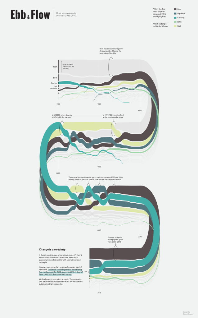
by Robert Janevic
In this viz, Robert made the stream graph the star of the show by maximising the use of white space around it. This helps to create a minimal yet striking design and keeps the audience focused on the graph itself, rather than being distracted by other visual elements.
by Olushola Olojo
In this viz, Olushola uses white space and shading to create a visual distinction between the charts and the supporting text. Notice how the borders are equally weighted around each element and have been kept intentionally blank for maximum impact.

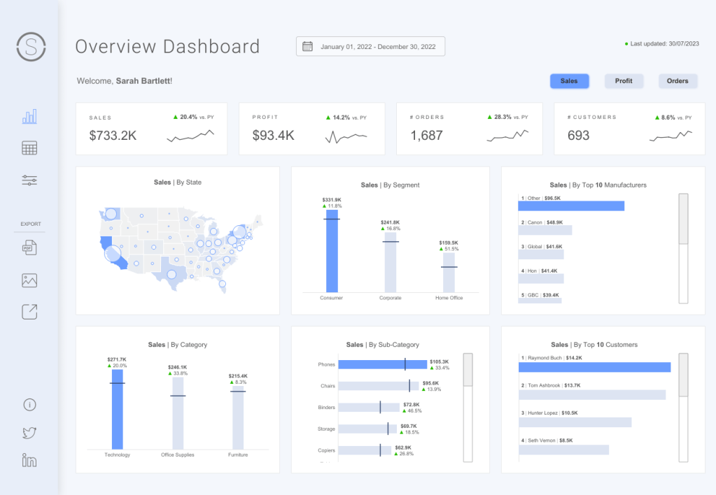
by Priya Padham
In this business dashboard, Priya has applied padding around each chart and KPI card. Combined with shading, this helps to create a subtle visual distinction between each element, giving each section room to breathe. Notice how Priya created space between the bars in the bar charts to help provide visual clarity, too.
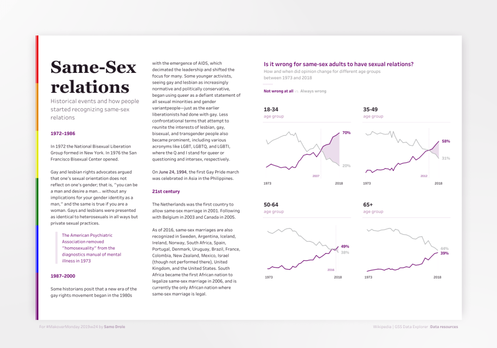
by Samo Drole
In this viz, Samo used a grey background and a shadow to frame the viz and give it a floating-like effect. This adds visual impact, helping to draw the audience’s attention to the viz itself.
For this challenge, you can viz any topic or data set you wish. The only requirement is that you consider white space in your design.
For data source inspiration, we encourage you to check out the following sites:
- Data is Plural – a weekly newsletter of useful/curious datasets, published by Jeremy Singer-Vine. There have been 309 editions to date. All of the datasets are saved to a Google sheet for easy reference.
- Flowing Data by Nathan Yau – a collection of datasets covering a broad range of topics
- Information is Beautiful – a collection of datasets compiled by the Information is Beautiful team covering a broad range of topics. They also have an additional collection of datasets used to drive the visualisations in the Beautiful News book.
- Public Data Sets – a list by Cole Nussbaumer Knaflic – a list of places to find free, publicly available datasets.
- Makeover Monday – a collection of over 350 data sets from previous Makeover Monday challenges.
How do I enter?
The process is simple:
- Source your data and build a viz where white space has been carefully considered in the design.
- Upload your viz to Tableau Public or somewhere where it can be openly viewed online.
- Fill in the submissions tracker (embedded at the bottom of this post) so we can keep track of who is participating. This step is essential if you want to request feedback or be credited in the wrap-up blog post.
- If you opted in for feedback in step 3, the co-hosts and I will provide some constructive feedback on your viz after the submission period closes.
Top Tips
- You can use any data set (assuming you have permission to share it publicly).
- Always remember to credit your data source/s on your viz.
- Refrain from using any images or logos on your viz unless you have permission to do so.
- Remember the Iron Viz judging criteria and try to focus on all three; Design, Storytelling and Analysis.
- Think outside the box!
Meet the Co-hosts
I’m excited to announce that I’ll be teaming up with two co-hosts this month! My co-hosts are both passionate about data viz design and frequently share inspirational vizzes on Tableau Public.
Priya Padham
Priya is a Data Visualisation Engineer II at Expedia Group and has been an active community member since early 2020. Later that year, she became a Tableau Featured Author and Tableau Public Ambassador, as well as receiving a community award at the Tableau Conference. She also recently became a Tableau Visionary for the first time in the 2023 cohort.

She loves experimenting with design and visualising data about her interests, such as her favourite music and movies. The #DataFam community is so inspiring and full of incredible people, and she loves connecting with members all over the world who share a passion for data.
Irene Diomi
Irene is a Tableau Visionary, recognised for her Mastery, Teaching, and Collaboration. She also holds the title of Tableau Public Ambassador for her contributions and leadership within the data community.
She enjoys learning, teaching, mentoring, and sharing new techniques with the data community. She also loves exploring ideas and concepts surrounding data through her speaking engagement, she was notably a speaker at the last Tableau conference.

Four of Irene’s works were selected as Tableau ‘Viz Of the Day’ for showing best practices and outstanding design. Irene has accumulated more than 100k views on her Tableau Public profile and her work has been featured in news outlets, a gallery, and a book. She is also an active contributor to the Tableau Community blog where she shares her experience and knowledge.
When is the submission deadline?
The deadline for submissions is midnight PST on Sunday, September 10th, 2023 October 1st, 2023. Please use the submission form below to submit your entry.
Feedback will be provided (to those who request it) via a conversation recorded and posted to YouTube between the co-hosts and me in September. On the submissions form you can specify if you require feedback focused on the Iron Viz scoring criteria (design, storytelling and analysis) or more general data viz feedback.
Please note, that if we receive a large number of feedback requests (more than we can cover in two hours), we’ll initially prioritise those from Tableau beginners or those entering #IronQuest for the first time. Any remaining feedback will be shared with the authors directly via email.
Continue the conversation and connect with other participants by following the #IronQuest hashtag on Twitter and LinkedIn.
Look out for the feedback video and recap blog post after we complete this challenge!
Thanks for reading and we look forward to seeing your entry!
