
Thanks to everyone who entered the Re-Viz-It challenge! It was great to see all of your viz recreations and we were inspired by your redesigns. Look out for the recap blog post, coming soon!
For those that want to continue redesigning vizzes from the Tableau Accelerators gallery, check out Season 2 of the Real World Fake Data (#RWFD) project! They will be selecting a viz to redesign every two weeks.
Meanwhile, we’re back with a brand-new #IronQuest challenge! This month as we have another community project collaboration for you; our first this year! For March/April, I’m excited to announce that we’ll be teaming up with the #DataPlusMusic project to visualise ‘Music Firsts‘!
What is #DataPlusMusic?

#DataPlusMusic is a new community project, launched by Tableau Visionary Sean Miller in December 2021.
Sean wanted to create a community project where participants could use music-themed data sets to create compelling visualisations to inspire others. Over the course of the project, Sean is offering participants the ability to learn and work with a few different music based APIs & Python libraries, such as Last.fm and Spotify. In addition to the monthly themed challenges, Sean encourages everyone to share their music-themed vizzes, whatever the topic, using the hashtag #DataPlusMusic.
The Theme
I’m excited to announce this months’ #IronQuest theme is ‘Music Firsts’.
What do we mean by ‘Music Firsts’? We’re challenging you to take a trip down memory lane and visualise data relating to your first music memory or experience; whether that be your first CD/cassette/LP, your first concert, or your favourite artist growing up. Whether that be The Backstreet Boys, Motown, The Beatles, Pink Floyd, Queen, or Britney Spears, we can’t wait to see what you come up with for this challenge!
For data source inspiration, I encourage you to check out data.world where you can find curated data sets on Billboard hits, Boybands, and much more.
Below are some vizzes that focus on music nostalgia for inspiration!
Inspiration
Below we’ve collected some vizzes from the community which represent the theme to inspire you. There are so many music vizzes on Tableau Public. These are just a few that caught our attention!
Click on any of the viz images to view them in full on Tableau Public.
First up is this viz by Jeff Plattner which shares 16 music-related memories, both happy and sad, tied to different songs. However over the letters to learn more about Jeff’s music memories.

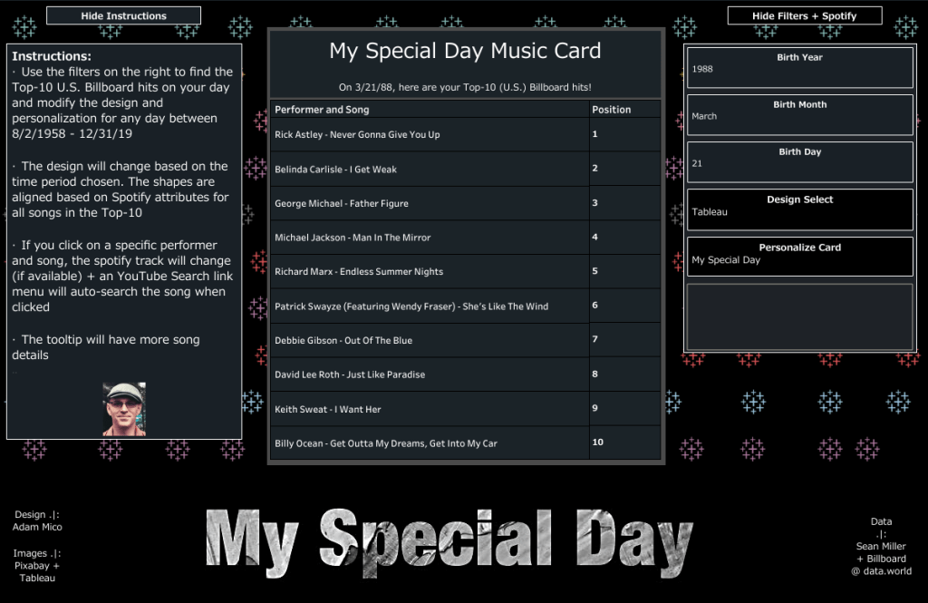
Next up are two vizzes by Adam Mico. In the first viz, Adam uses a Top 10 U.S. Billboard hits dataset to enable the user to find the songs that were top 10 on a chosen date. Interact with the viz to find out what songs were top of the charts when you were born!
The second viz is a collaboration with Kevin Flerlage. In this viz, Adam and Kevin explore their shared love of The Beatles, comparing their favourite band member, songs, and much more!

Music often reminds us of other people too. Next, we two vizzes that were inspired by memories of family members.
First up we have a viz by Robert Janezic. This viz tells the story of Robert’s Mother, through a collection of memories and life events that are tied to music. Below is a small portion of the viz. This viz is best explored on Tableau Public. I highly recommend checking it out!

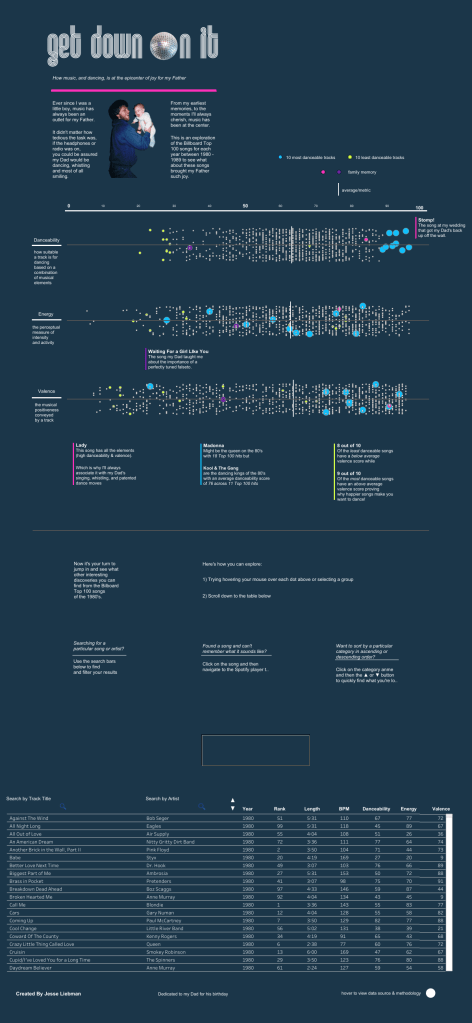
Second, we have a viz by Jesse Liebman which focuses on the 80’s hits that his Father used to enjoy dancing to.
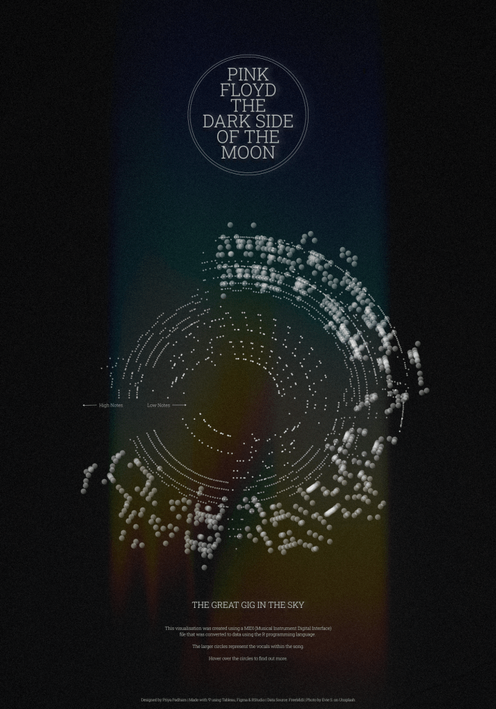
Last month, the #DataPlusMusic project ran a challenge that encouraged participants to visualise MIDI (Musical Instrument Digital Interface) files. Unlike regular audio files like MP3s or WAVs, these don’t contain actual audio data and are therefore much smaller in size. They instead explain what notes are played, when they’re played, and how long or loud each note should be. Using a few lines of code in R, participants were able to create beautiful visualisations using MIDI files from some of their favourite songs. Below is an example of Pink Floyd’s ‘Dark Side of the Moon’, visualised by Priya Padham.
How do I enter?
The process is simple:
- Source your data and build a viz that somehow touches upon the chosen theme for the month.
- Upload your viz to Tableau Public or somewhere where it can be openly viewed online.
- Fill in the submissions tracker (embedded at the bottom of this post) so we can keep track of who is participating. This step is essential if you want to request feedback or be credited in the wrap-up blog post.
- If you opted in for feedback in step 3, the co-host and I will provide some constructive feedback on your viz after the submission period closes.
Top Tips
- You can use any data set which fits the theme (assuming you have permission to share it publicly).
- Always remember to credit your data source/s on your viz.
- Refrain from using any images or logos on your viz unless you have permission to do so.
- Remember the Iron Viz judging criteria and try to focus on all three; Design, Storytelling and Analysis.
- Think outside the box!
Meet the Co-host
I’m very excited to announce that I’ll be teaming up with Sean Miller this month!

By day, Sean is a Lead BI Developer at Cerner Corp where he leads the dataviz strategy for Cerner’s standard EMR analytics. He and his team also lead an Analytics Center of Excellence to provide training and supports both internal analysts and clients.
By “night” Sean is an enthusiastic member of the Tableau #Datafam. While participating in everything including co-leading the Kansas City TUG and being a #WorkoutWednesday coach, there’s always something new I’m working on. He enjoys getting to know newer Tableau users and getting them started with the basics.
When is the submission deadline?
The deadline for submissions is midnight PST on Saturday, April 30th. Please use the submissions form below to submit your entry.
Feedback will be provided (to those who request it) via a conversation recorded and posted to YouTube between Sean and me, shortly after the deadline date. On the submissions form you can specify if you require feedback focused on the Iron Viz scoring criteria (design, storytelling and analysis) or more general data viz feedback.
Please note, if we receive a large number of feedback requests (more than we can cover in two hours), we’ll initially prioritise those from Tableau beginners or those entering #IronQuest for the first time. Any remaining feedback will be shared with the authors directly via email.
Continue the conversation and connect with other participants by following the #IronQuest hashtag on Twitter and LinkedIn.
Look out for the feedback video and recap blog post after we complete this challenge!
Thanks for reading and we look forward to seeing your entry!
Header image by Eric Nopanen on Unsplash
