For the first #IronQuest project of 2022, I had the pleasure of teaming up with CJ Mayes to co-host the ‘Re-Viz-It’ round. For this round, we challenged participants to re-visit an older viz from their portfolio and re-create it with the #IronViz scoring criteria in mind, or redesign a viz from the Tableau Accelerators gallery.
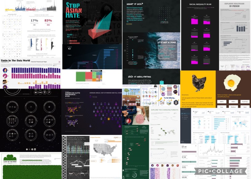
We received a total of 19 submissions for this round and welcomed 6 first-time participants to the project! As always, it was fantastic to see the diverse range of topics covered and the creativity shown throughout the entries. For this round, it was great to see many participants revisit some of their older vizzes and take a different approach with their updated versions. For many, this involved putting some newly acquired skills to use, digging deeper into the data and unveiling new insights, or even making use of new Tableau features that weren’t around when the vizzes were first published. For those that redesigned a Tableau Accelerators gallery dashboard for this round, it was an opportunity to practice modern dashboard design and experiment with different layouts and UX elements.
We were lucky enough to have three entries recognised as ‘Viz of the Day‘ this round too! Congratulations to Pradeep, Alisha and Tina on having your work featured by Tableau Public!
(click the images below to view the interactive vizzes on Tableau Public)
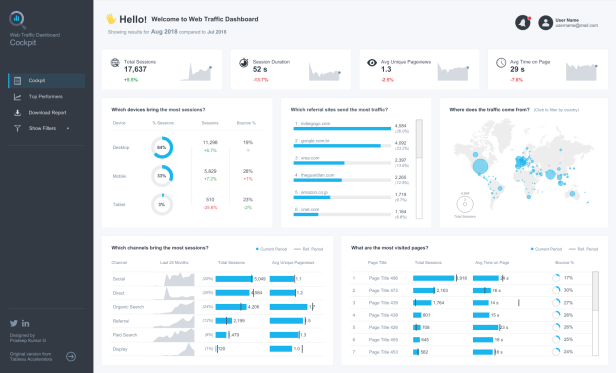
Pradeep Kumar G – Web Traffic Dashboard | Digital Marketing
For this viz, Pradeep designed his own take on a dashboard from the Tableau Accelerators gallery. This beautiful business-style dashboard features a modern design with lots of well-considered design and analytical elements including alerts, reference lines, sidebar navigation and careful use of colour. I highly encourage you to download the dashboard from Tableau Public and take a look at how it was built!
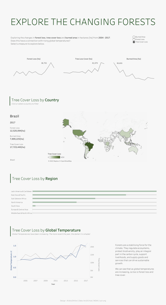
Alisha Dhillon – Explore the Changing Forests
For this viz, Alisha redesigned a viz she first published in 2020 on forest loss, tree cover loss and burned areas. With the new version, she took a minimal approach, increasing the use of white space and simplifying her use of colour. She also changed the orientation of her viz to long-form to help guide her audience through the story. The result is an effective, easy-to-consume viz.
Tina Covelli – The Vicious Cycle of OCD (trigger warning)
For this viz, Tina completely reimagined a viz she first published in 2021. The original was an infographic designed to fit a single screen. In the reimagined version, Tina used a visual metaphor of crashing waves to help tell the story of Obsessive-Compulsive Disorder (OCD), its prevalence, and how it can affect those who experience it. This is a powerful viz that takes a detailed look at a sensitive topic. You’ll notice that this long-form viz is split into sections to help guide the reader through the story. Each element of the story is well-explained, often with interactive elements to help engage the audience. I really appreciate how Tina included both a trigger warning at the top, given the sensitive nature of this topic and a call to action at the bottom.

Highlights
In addition to the vizzes mentioned above, there are a few vizzes I would like to give a special mention. There were many fantastic entries this round but these vizzes each deserve a special mention for their uniqueness and/or approach to design, storytelling and analysis (the Iron Viz scoring criteria).
Aiden Bramel – Sales vs. Target Dashboard Accelerator
A first-time #IronQuest participant, Aiden also reimagined a Tableau Accelerator gallery viz. This business-style dashboard focuses on sales and margins, highlighting performance versus target. The ‘Cockpit’ dashboard design and use of colour make it easy to identify, at a glance, where performance is below target and where action may be required. Meanwhile, the tabs at the top enable the user to navigate to more in-depth views of customer and product performance. Aiden also included a nifty ‘Settings’ button which includes radio buttons that allow the user to switch to alternative comparison points.

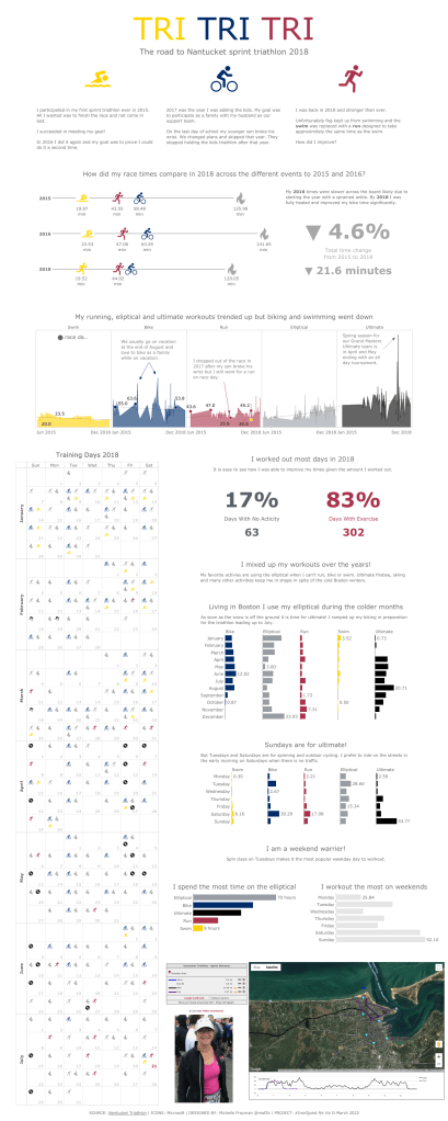
Michelle Frayman – Tri Tri Tri
In this quantified-self viz, Michelle reimagined her 2019 viz in which she tracked her 2018 Nantucket sprint triathlon training data. With the new design, Michelle took a more detailed approach, reducing the size of the training days table to create more space for a monthly and weekly summary of her training schedule. I like how Michelle used icons and colours consistently throughout this viz, while her use of annotation and text helps to explain the data, and story, to her audience.
Feedback
CJ and I provided feedback to everyone who requested it during our conversation, which has since been posted on YouTube.
You can listen to our feedback here:
We reviewed the vizzes in alphabetical order, by author’s first name. The video is split into chapters to make it easier for you to jump to vizzes of interest.
We covered vizzes by the following authors, reviewed in this order:
Aakarsh
Alisha Dhillon
Chimdi Nwosu
DataKo
Dennis Kao
Elisa Davis
Ervin Vinzon
Jessica Moon
Michelle Frayman
Pradeep Kumar G
Saverio Rocchetti
Simon Rowe
Sum Kiu Chang
Young Song
All Submissions
THANK YOU to everyone who submitted entries for taking the time to create and share your work! Also, a big thank you to CJ for being a fantastic co-host.
All of the entries are posted below (with the exception of those mentioned above) in alphabetical order by authors’ first name. If you tweeted your viz or thought you submitted one via the Google Form but don’t see it here, let me know and I’ll work to include any additional entries ASAP.
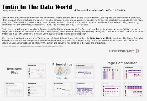
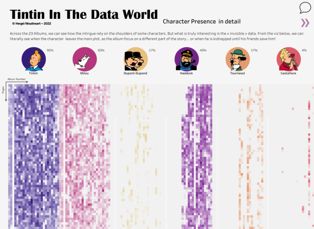
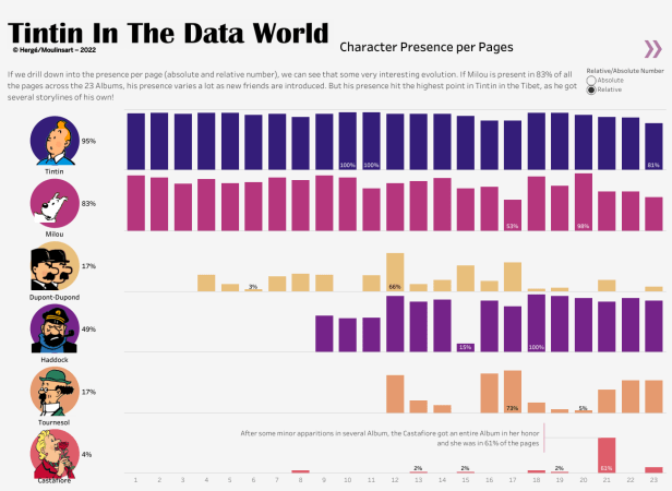
Annabelle Rincon – Tintin in the Data World
Note this viz spans multiple pages. I have included a few below for reference. Check out the viz on Tableau Public for the best experience!
Aakarsh – Dark Web Index Price
Note this viz spans multiple pages. Check out the full viz on Tableau Public for the best experience!

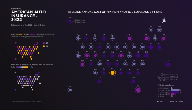
Chimdi Nwosu – U.S. Car Insurance Rates in 2022
Note this viz spans multiple pages. Check out the full viz on Tableau Public for the best experience!
DataKo – 5 Years of Unleaded

Dennis Kao – Stop Asian Hate

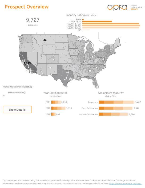
Elisa Davis – Prospect Overview
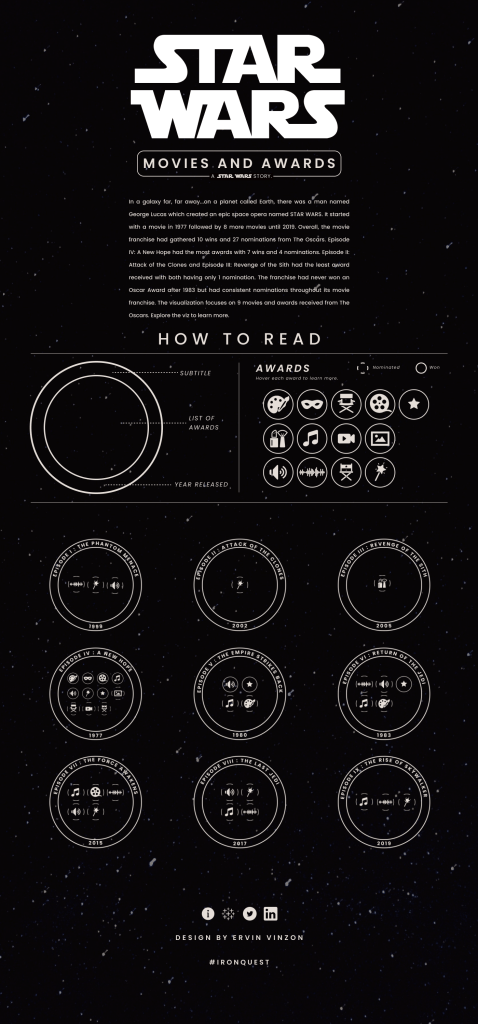
Ervin Vinzon – Star Wars: Movies & Awards
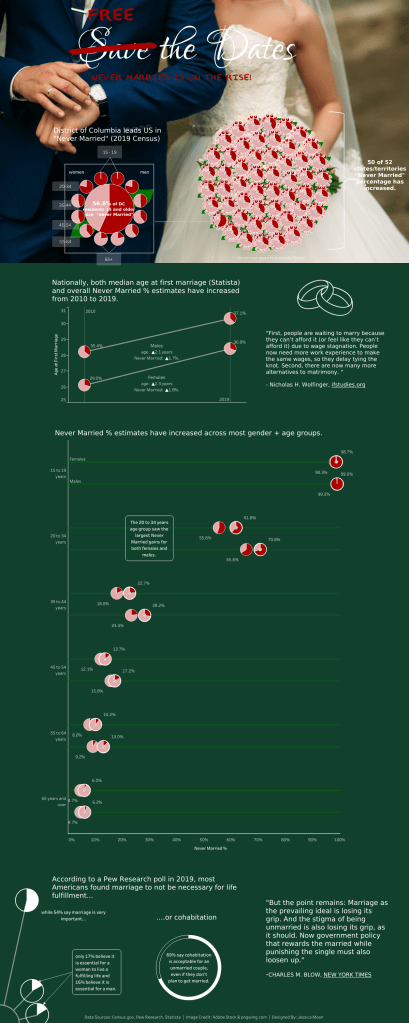
Jessica Moon – Never Married on the Rise
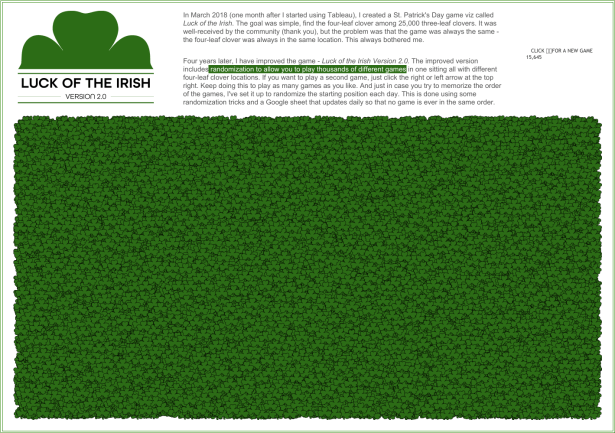
Kevin Flerlage – Luck of the Irish
Note this is a fun, interactive game! Check out the full viz on Tableau Public for the best experience!
Saverio Rocchetti – Racial Equality in HR

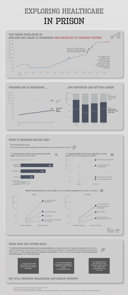
Simon Rowe – Healthcare in Prison
Sum Kiu Chang – The Story of Huffpost
Note this viz spans multiple pages. Check out the full viz on Tableau Public for the best experience!

Virginia Moench – The Chicken or the Egg – Which Came First?
Note this is a fun, interactive game! Check out the full viz on Tableau Public for the best experience!

Young Song – Microbial World in a Plastic Bottle

If you would like to join the next project, there’s already a brand-new #IronQuest round underway! Running until the end of April, we’re teaming up with the #DataPlusMusic project to visualise ‘Music Firsts’. Read the blog post for the full details.
Stay up to date with all things #IronQuest by following the hashtag #IronQuest on Twitter and LinkedIn. Check out the Iron Quest section of my blog for details of the latest projects and how to participate.
Thanks for reading.
