At the beginning of the year I launched #IronQuest, a community-led data visualization project which follows a similar format to the Tableau Iron Viz feeder competitions.
You can read more about #IronQuest here.
Business Dashboards
For month two (February 2019) the chosen theme was business dashboards. I must admit I was initially quite surprised to see this theme win the popular vote. Many of us who use Tableau in our jobs spend all day building or interacting with business-style dashboards. It’s not uncommon for people to want to focus on vizzing more informal data sets outside of work so it’s no wonder that many of the more popular vizzes on Tableau Public are those with a creative-edge that cover a multitude of topics such as sports, music or even quantified-self. While these vizzes are often visually appealing they would rarely be an obvious choice for a business setting. That doesn’t mean to say business dashboards are or should be boring, but a radial bar chart might not be the best chart choice if you’re visualising financial data at work, for example.
I suspect the business dashboard theme was popular because people like to seek inspiration from the community. While this could be inspiration to try new chart types or visual techniques it is also a great place to get inspiration for work projects. Speaking from personal experience, I get excited when I see a business dashboard ‘in the wild’ that I can apply in a business setting of my own. Imagine my excitement when ‘The Big Book of Dashboards’ was launched. This is a book literally FULL of real-world dashboard examples!
Thankfully, the ‘underwhelming’ business dashboard ideology didn’t put people off (phew)! In fact, 35 people entered the challenge this month, up from 27 in January. Better still, over 50% of people who took part this month have never entered an Iron Viz competition before either. It’s great to see so many new people getting involved this month and I hope this trend continues and carries through to Iron Viz too. As usual, the participants were creative with the theme. We saw various different takes on the classic Superstore Sales data set as well as dashboards covering fictional companies, real-life companies, quantified-self, higher education and healthcare. Topics aside we also saw a wide variety of chart types and techniques applied in the submissions; including but not limited to sparklines, hex maps, BAN’s, lollipop charts and bar charts.
As promised, Ann Jackson will be joining me to provide feedback to those who requested it. Look out for an email from me soon if you requested feedback.
THANK YOU to everyone who submitted entries for taking the time to create and share your work! Also, a big thank you to Ann for being a fantastic co-host.
The entries are posted below in reverse-alphabetical order by first name. If you tweeted you viz or thought you submitted one via the Google form but don’t see it here, let me know and I’ll work to include any additional entries ASAP.
Please click on the images to view the visualizations on Tableau Public (or similar). Show your support for the participants by favouriting the vizzes you like the most.
Young S.
The Great Barrier Reef Temperature Monitor

Young S – The Great Barrier Reef Temperature Monitor
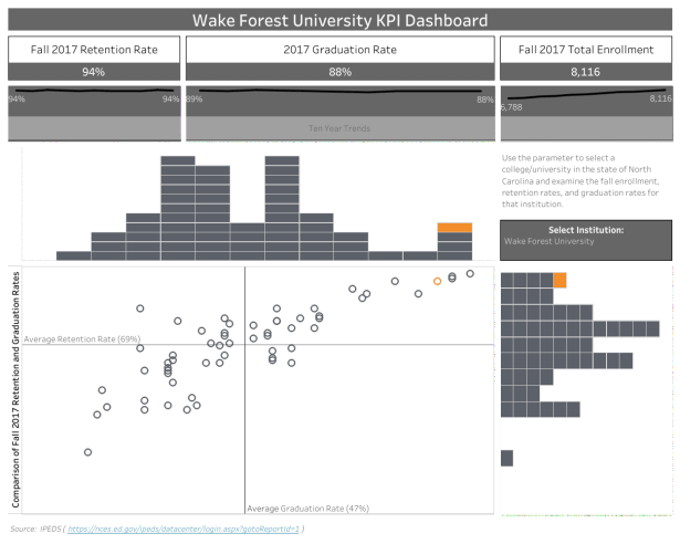
Virginia (Ginny) M.
University KPI Dashboard
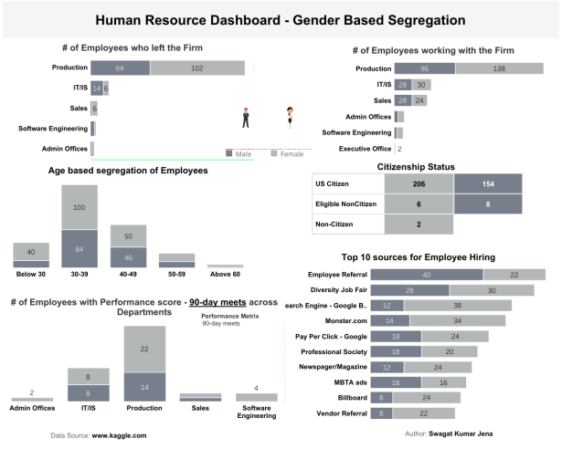
Swagat K.J.
Human Resources Dashboard
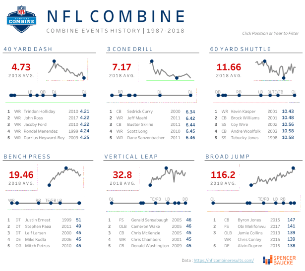
Spencer B.
NFL Combine
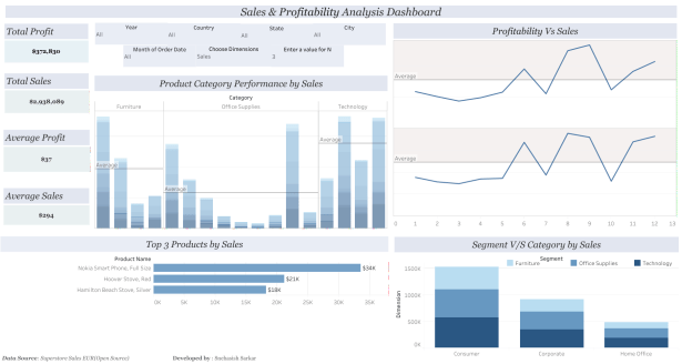
Snehasish S.
Sales & Profitability Analysis Dashboard
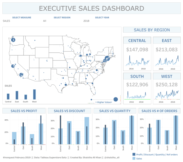
Shaistha A.K.
Executive Sales Dashboard
Saujanya E.
Data Center Operations Dashboard

Saujanya E – Data Center Operations Dashboard
Ruandi V.Z.
Sales Report

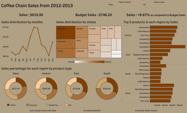
Riddhi T.
Coffee Chain Sales Dashboard
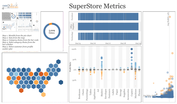
Regis O.
Superstore Customer Profit Ratio Profiler

Regis O – Superstore Customer Profit Ratio Profiler
Ravi M.
Monthly Report

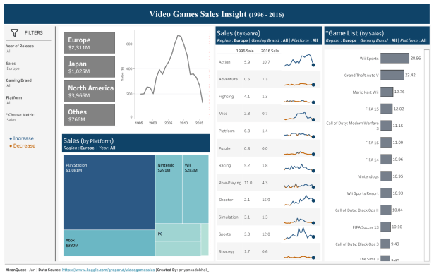
Priyanka D.
Video Games Sales Dashboard
Ojoswi B.
Superstore Customer Profiling
Naveen B.
Human Resources – Headcount Overview

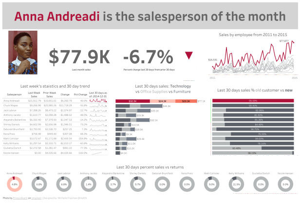
Michelle F.
Sales Person of the Month
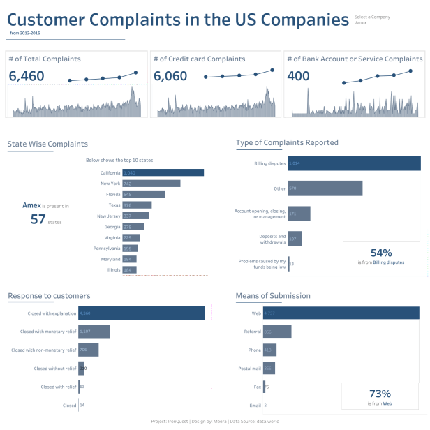
Meera L.
Customer Complaints
Mahadevan K.
Business Dashboard

Lali J.
Tax Collection Performance of the Bureau of Internal Revenue

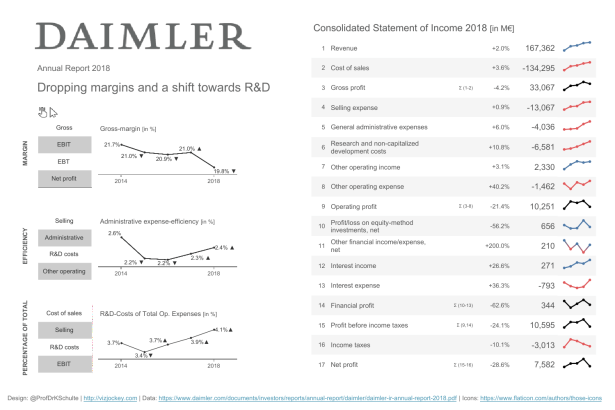
Klaus S.
DAIMLER Annual Report 2018: Dropping margins and a shift towards R&D
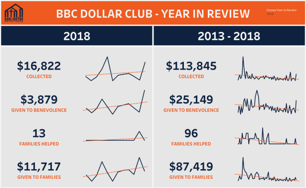
Kevin F.
BBC Dollar Club – Year in Review
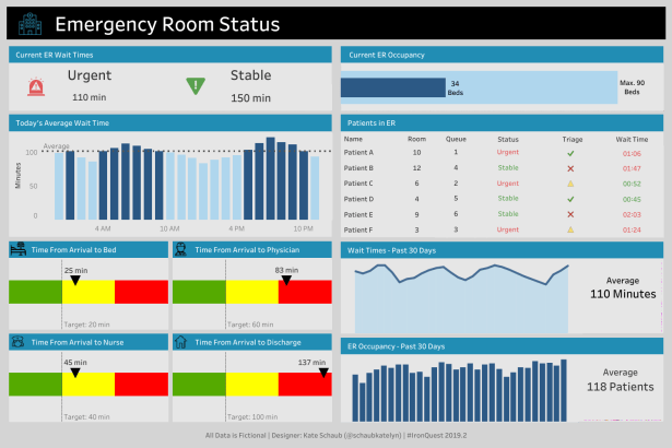
Katelyn S.
Emergency Room Status
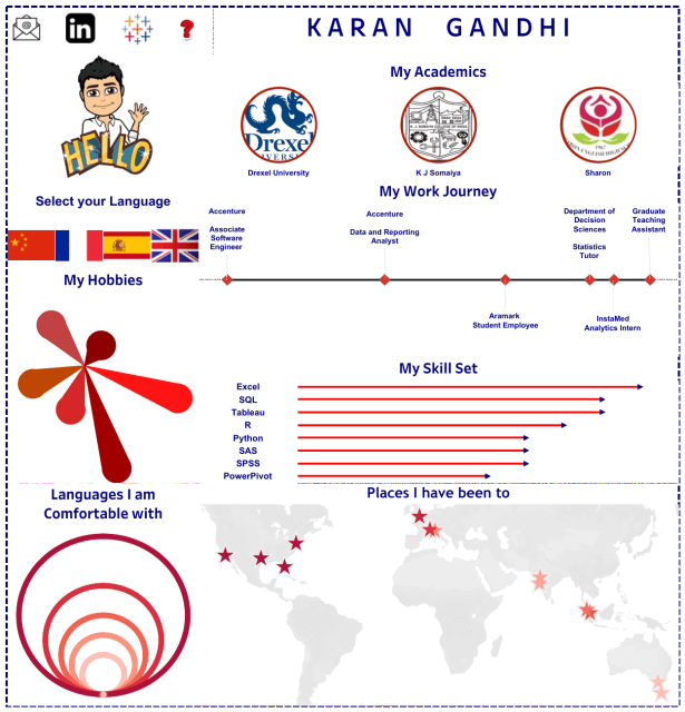
Karan G.
Bilingual Vizume
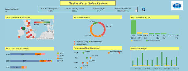
Kaliraj S.
Nestle Water Sales Review
Jeff P.
#PlanToGrow Tracker 2019
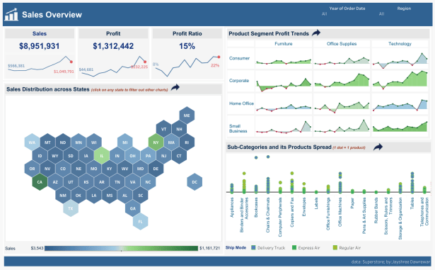
Jayshree D.
Sales Overview by Product
Daniel L.
Superstore Dashboard
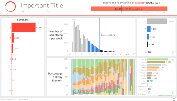
Daniel C.
Important Dashboard
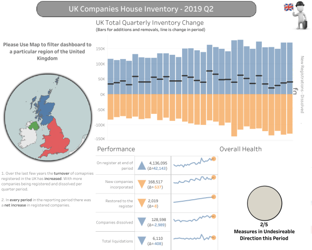
Chris D.
UK Companies House Inventory
Charles S.
Net Promoter Score Summary

Basavaraj G.
Recruitment Dashboard

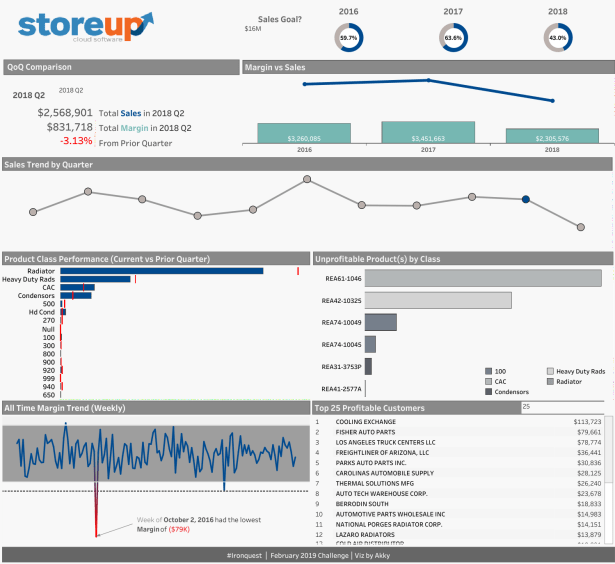
Aquinov (Akky) M.
Business Performance
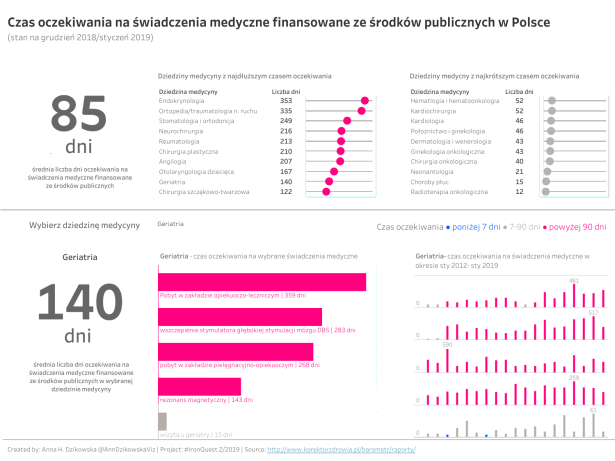
Anna D.
Waiting Times for Public Healthcare in Poland (in Polish)
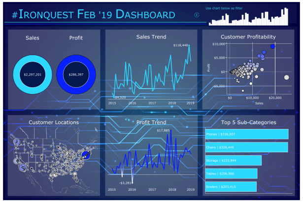
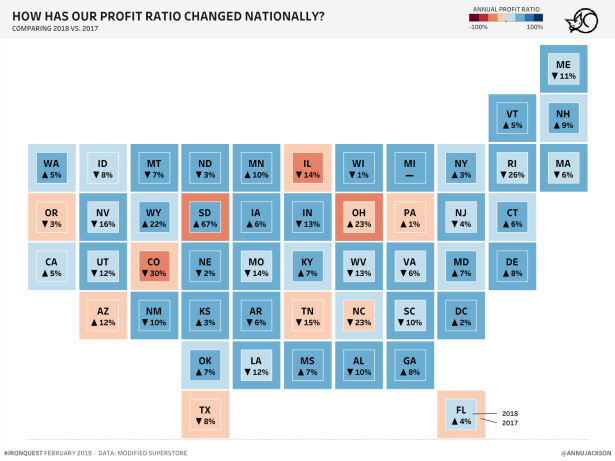
Ann J.
How Has Our Profit Ratio Changed Nationally?
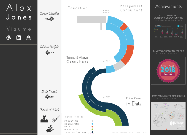
Alex J.
Alex Jones – Curriculum Vitae
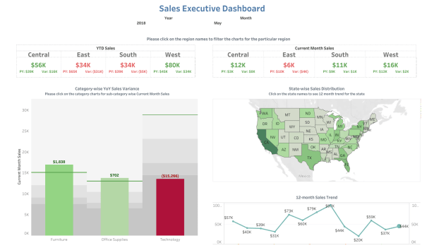
Aisharyya A.
Sales Executive Dashboard
Click ‘like’ below if you’ve enjoyed this post. This helps to let me know that the time it takes to pull this together is worthwhile!
The next monthly theme is Environmental Issues and will run until midnight PST on 31st March 2019. You can find out more about the next challenge and how to get involved here.
Follow the hashtag #IronQuest on Twitter and LinkedIn and check out the Iron Quest section on my blog for more info.
Thanks for reading.

Great works, Sarah & all participants! Just a quick question. I saw one article saying that white background is recommended for ‘so-called’ business dashboard. There are many submissions with colored background. What do you think about it? https://bibrainz.com/blog/7-easy-ways-to-humanize-your-ugly-business-intelligence-dashboards/
LikeLike