For Back to Viz Basics (#B2VB) week 1, the challenge was to build a scatter plot. The selected data set focused on NCAA Men’s Basketball coaching records, namely the winningest active coaches (those with a win rate of 50% or higher). For each coach, it included their win rate and the number of seasons’ coaching experience they held. In the challenge description, Eric specifically mentioned he would like to understand if there is a relationship between seasons coaching and overall win percentage.
It’s worth noting that I know nothing about college basketball so I approached this dataset from a completely unbiased perspective. I’m sure if I was more knowledgeable in the different teams and coaches, my approach may have been different. Regardless, I didn’t want to get distracted by researching college basketball coaches; something I would usually do when approaching an unfamiliar dataset. My goal with this project was to focus on the data alone and determine what it was telling me about the relationship between coaching experience and performance.
My Approach
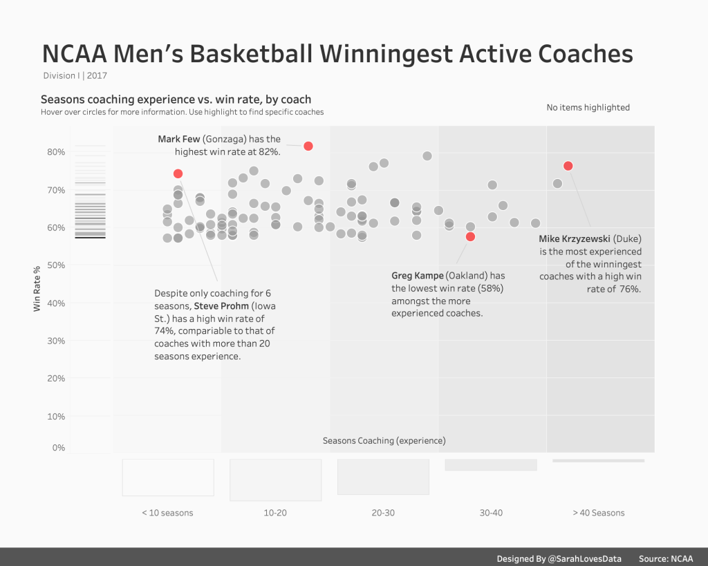
[Alt Text: An image of my completed viz; a scatterplot showing the relationship between win rate and seasons coaching experience for each coach in the dataset]
I created a scatterplot to show the relationship between the win rate (%) and the number of seasons coaching experience, per coach. Upon doing this, I noticed various interesting aspects of the dataset;
- The dataset appears to be incomplete since there are no coaches with a win rate of less than 50%. Either all of the judges have high win rates, or there’s data missing. I later realised that since this dataset focuses on the ‘winningest’ coaches only, it excludes any coaches with win rates lower than 50%.
- More experienced coaches do not necessarily have higher win rates than lesser-experienced coaches. In fact, some lesser-experienced coaches have higher win rates than those that have been coaching for more than 20 seasons.
These observations help inform my design choices and approach.
My objective with this viz was to make it easy for my audience to get a sense of the distribution of coaches by win rate and their respective seasons of coaching experience. It’s also worth noting that i chose to design this viz entirely in Tableau. While I often use Figma to create design elements or backgrounds for my vizzes, I didn’t think it was necessary in this instance.
I’ve described a few of the design choices I took when building this viz below.
Gradient Shading (Reference Bands)
To simplify the coaching experience data I firstly condensed the coaching experience data into 5 distinct groups or buckets, ranging from less than 10 seasons’ experience to over 40 seasons’ experience, using a calculated field. I wanted to visually differentiate between coaches by their experience. However, I didn’t want to use colour, size or shape to encode the marks in the viz as I felt this would have been distracting or ineffective. Instead, I chose to apply a grey gradient shading to the background of the scatterplot; the darker the grey, the more coaching experience. I achieved this by adding individual reference bands; one for each coaching experience bucket. I added these manually by specifying constant values for the upper and lower ranges of each bucket. With each bucket, I chose a slightly different shade of grey to help differentiate them.
Margional Histogram and Barcode Chart
After seeing Andy Cotgreave’s marginal histogram for this round of #B2VB, I was inspired to try something similar. Marginal histograms are histograms added to the margin of each axis of a scatter plot (or rows and columns of a highlight table) for analysing the distribution of each measure. They are one of my favourite analytic approaches for showing distribution. However, I didn’t want to apply a traditional marginal histogram in this instance. Instead of adding a bar chart below the seasons coaching axis with bars to represent the number of coaches per year of seasons coaching, I used the bucketed coaching experience data to create 5 bars; one for each of the seasons coaching buckets. This enabled me to show, at a glance, which bucket had the most coaches (it was coaches with 10-20 seasons of experience, if you were wondering). I thought this summerised view would be more insightful than a busier bar chart with bars representing the individual seasons experience and the number of coaches in each.
For the win rate, I decided to create a barcode chart (aka strip plot) instead of a histogram. Barcode charts are great for showing concentrations or frequency of data. In this case, I wanted to show the concentration of coaches by win rate. The coaches appeared to be very condensed in the 55% to 70% range so I wanted to see, at a glance, which win rates were most common. I built the barcode chart in a separate worksheet and added this to the left-hand side of my scatterplot.
Shading and Annotations for Outlier Coaches
As I mentioned at the beginning of this post, I know very little about college basketball and nothing about college basketball coaches! However, I noticed that some coaches appeared to be outliers in this dataset. Some had high win rates compared to other coaches with the same experience, while others had more experience than most. I decided to focus attention on these coaches by shading them in red (the only colour used in this viz, aside from grey) and adding annotations to explain why they stand out. My annotations are simply based on observations I made from the data. In the annotation text, I opted to include the coaches’ team as I thought this could be insightful for anyone more knowledgable in college basketball.
Highlight Action for Coaches
I added a highlight action for coaches so the audience could easily locate specific coaches in the scatterplot, rather than having to sift through all of the marks individually. In hindsight, I should have included a highlight action for team also since the audience may not necessarily know the name of the coach they are looking for but are likely to know the name of the team.
Y-Axis (Win Rate) Starting from Zero
After publishing my viz and sharing it on Twitter, a few people asked me why I didn’t truncate the y-axis and start it from around 50% (since the lowest win rate in the dataset was ~57%). However, I felt as through this could be misleading, since it may have given the impression that coaches at the lower end of the winningest group have a lower win rate than they do in reality, at first glance at least. I always prefer to err on the side of caution when it comes to truncating axis!
I really enjoyed working on this scatterplot and I can’t wait to participate in the next #B2VB challenge!
Thank you to Eric Balash for starting this new community project.
Thanks for reading.
