Regardless of where you are in the world, the Coronavirus pandemic will have almost certainly impacted your daily life in some way. Whether that involves exercising more, perfecting your sourdough technique, watching Tiger King on Netflix or attempting to homeschool your children, your daily routine is most likely very different now compared to how it was at the beginning of the year.
Given that the current circumstances are quite unique, I thought it would be an interesting time to start tracking data about our lives and visualising the results. With that in mind, this months’ #IronQuest topic is ‘Quantified Self’.
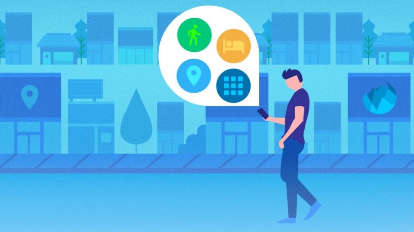
If you aren’t sure what quantified self is, read on.
I was first introduced to the notion of quantified self by Tim Ngwena (aka @TableauTim). Tim spoke at a #LondonTUG back in June 2017 about his quantified self projects. In particular, Tim enlightened us to just how much companies such as Google know about our daily lives and our travel habits. However, Tim used this to his advantage as he was able to download his Google location history and visualise the data in Tableau. The results were fascinating!
If you want to learn more about Tim’s process, you can read about it here. He has a whole section on his blog dedicated to quantified self too.
Tim also introduced me to Nicholas Felton and his famous ‘Feltron’ Annual Reports. For 10 years, Felton recorded and illustrated aspects of daily life and published the results each year is a beautiful report full of infographics and charts. The Feltron Annual Reports are no longer available to purchase but you can explore them online here.
I’ve included a few examples of Felton’s reports below:
Another famous quantified self project was of course ‘Dear Data’, a postcard exchange project between designers, Giorgia Lupi and Stefanie Posavec. Giorgia (based in the US) and Stefanie (based in London, UK) exchanged a postcard a week for 52 weeks. Each week they tracked data on a different topic related to their daily lives. The topics included everything from the number of times they looked at their phones in a given day or the number of strangers they smiled at each day, right through to the contents of their wardrobes!
Once they had collected their data they each created a hand-drawn visualisation on a postcard and exchanged it with each other. The postcards are now on display at MoMA and published in their book, ‘Dear Data’.
I’ve included a few examples of their postcards below:


In 2019, Ann Jackson and I decided to attempt our own ‘Dear Data’ project, using the original project topics as a framework. While this was a lot of fun, we only completed around 15 weeks until the work became too much! Tracking minute details about our lives every week was time-consuming and original postcard designs became hard to formulate and design. You can read about our weekly postcard exchanges here.
I’ve also included a few of our postcards below:
Quantified self vizzes aren’t uncommon in the Tableau Community either.
Many people have started publishing their own quantified self vizzes since the lockdowns started. One of my favourites is this viz by Judit Bekker:

Judit drew the layout of her apartment and overlaid this with a heatmap of what she does where and how long she spends in each area. I love Judit’s design style and this concept really resonates with me, especially during lockdown since we’re spending so much time at home. You can read about how Judit built this viz here.
Struggling for Inspiration?
This month is a little different in the sense that you will create your own dataset! However, this may prove to be more challenging than it seems. If you are struggling to know where to begin, here are a few ideas and tutorials to get you started.
My advice would be to track something that matters to you. It doesn’t need to be structured or complex. In fact, try and keep it as simple as possible. Tracking one thing for one week in the easiest way to get started. Pick something that is important to you. This could mean keep a tally every time you drink a cup of coffee or recording how many hours you sleep each night. You don’t need access to any fancy bits of tech to get started either. Pen and paper is more than sufficient!
The act of tracking increases your awareness, which can have immediate benefits. After a few days, the data will probably highlight trends and behaviors you may not have known (who knew you drank that much coffee).
Fitness Data
How to track your fitness data with Strava and Tableau by Andy Cotgreave
Visualising Fitness Data by Eva Murray
Fitbit Tableau Web Data Connector
Music Data
Visualize your listening habits with Last.fm and Spotify data by Andy Cotgreave
Netflix Data
Download and View your Netflix Viewing Activity
Twitter Data
Download and view your Twitter Data
More Inspiration
Quantify Yourself: (Mostly) Free Tools & Strategies to Track (Almost) Every Area of Your Life
How to find the best sources for free, public data sets by Jacob Olsufka
Reporter App – Reporter is an iPhone app for understanding the things you care about. With a few randomly timed surveys each day, Reporter can illuminate aspects of your life that might be otherwise unmeasurable.
IFTTT – Use IFTTT iPhone buttons and Google Sheets to easily track your own data.
Getting Started – Tips from QuantifiedSelf.com.
Create your own data set by David Murphy
If you have any other ideas or ways to collect quantified self data, please add them to the comments at the bottom of this post!
How can I enter?
The process is simple:
- Source your data and build a viz that somehow touches upon the chosen theme for the month.
- Upload your viz to Tableau Public or somewhere where it can be openly viewed online.
- Fill in the submissions tracker (embedded at the bottom of this post) so we can keep track of who is participating. This step is essential if you want to request feedback or be credited in the wrap-up blog post.
- If you opted in for feedback in step 3, the guest judge and myself will provide some constructive feedback on your viz after the submission period closes.
Top Tips:
- You can use any data set which fits the theme (assuming you have permission to share it publicly).
- Always remember to credit your data source/s on your viz.
- Refrain from using any images or logos on your viz unless you have permission to do so.
- Remember the Iron Viz judging criteria and try to focus on all three; Design, Storytelling and Analysis.
- Think outside the box!
Who is my guest judge?
I’m very excited to announce that I’ll be teaming up with Tableau Public Ambassador, Ivett Kovács this month!

Ivett works as a senior data visualization developer and designer at Starschema in Budapest, Hungary. Ivett has helped some of the most well known companies use data to make more effective decisions, solve tough problems and increase effectiveness.
Ivett has a gift for taking complex data and making it accessible and understandable by developing creative, informative and functional visualizations. For Ivett, dataviz is both a job and a hobby.
Ivett’s Tableau Public portfolio is filled with impressive, well-designed vizzes. Here are just a few of them:


When is the submission deadline?
The deadline for submissions is midnight PST on Friday 5th June 2020. Feedback will be provided (to those who request it) by Ivett and I shortly after the deadline date.
Continue the conversation and connect with other participants by following the #IronQuest hashtag on Twitter and LinkedIn.
Thanks for reading and we look forward to seeing your entry!

Your post is an excellent introduction to the quantified self worldview. And the examples provided are strong. Thank you for putting this together.
When I began measuring my own performance, in various aspects of my life, I soon noticed that those metrics started improving. Which I feel is some sort of natural/automatic response to measuring something in the first place.
Learned a lot here.
LikeLiked by 2 people
Thank you, Bret! I agree. The very act of measuring aspects of your life forces you to access things and strive for improvements.
LikeLiked by 1 person