A few weeks ago I published my 100th Tableau Public viz. It seems to have taken me forever to get here but what a journey it has been!
Participating in projects such as #MakeoverMonday and #VizForSocialGood over the last two years has taught me so much about Tableau, data visualisation best practices and my own strengths and weaknesses. I can safely say I have enjoyed building all of the vizzes on my Tableau Public profile and each one has taught me something new.
Where it all began
I joined Tableau Public on 29th February 2016 after hearing about the (then 9-week old) #MakeoverMonday project through Twitter. Whilst I was already using Tableau at work at this time I was still very new to the product and was looking for a way to stretch my Tableau skills. I had been following #MakeoverMonday since it began in January 2016 and decided it was about time I got involved.
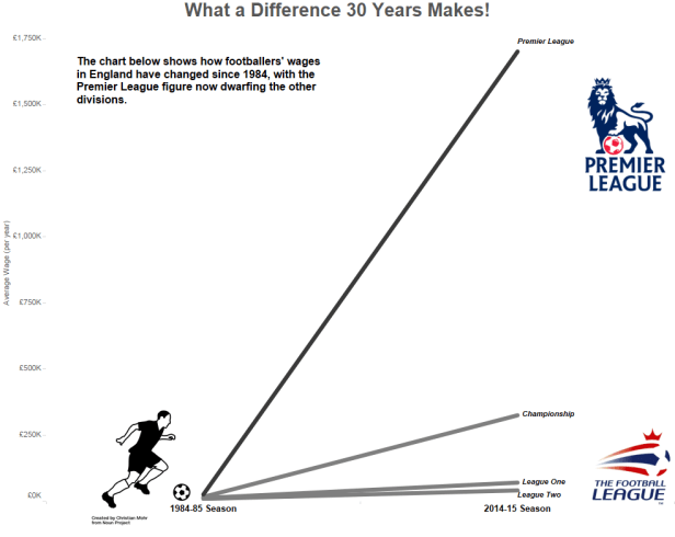
I was incredibly nervous about sharing my Tableau vizzes with people outside of work for the first time. However, I took the plunge and published this viz on Tableau Public and Twitter for #MakeoverMonday week 9:

While it’s nothing ground-breaking it marked a significant moment in my Tableau journey. If I hadn’t have got involved in the way that I did, when I did, I am certain that I wouldn’t be where I am today.
Over the weeks and months that followed I got more involved in the #MakeoverMonday project and ended the year having created a total of 17 #MakeoverMonday vizzes. I published some less than perfect vizzes in the early days but all of them are still available to view on my Tableau Public portfolio. As Andy Kriebel often says, it’s important to show skills progression on your Tableau Public portfolio so never delete your older work. I wholeheartedly agree with this statement. It’s important that you can show improvements in your work over time as this shows you are learning and progressing.
During the initial months of participating in #MakeoverMonday I was able to build friendships with other regular participants through Twitter and take on board their feedback to help me improve my work too. Michael Mixon, Neil Richards, Pooja Gandhi, Adam Crahen, Charlie Hutcheson and of course Andy Kriebel were all hugely inspirational and welcoming during those first few months and continue to inspire me today. Thank you all.
Why and what do I viz?
While writing this post I thought it would be interesting to go back through my Tableau Public profile and look at all 102 vizzes (at the time of counting); noting how many I have produced and for what purpose.
As you can see from the chart below, the majority of my vizzes were produced for #MakeoverMonday. This comes as no surprise to me. I make an effort to participate in #MakeoverMonday each week. The project gives me an opportunity to try new techniques, tackle more complex data sets or simply be creative and have fun.
On the other hand projects such as the #SWDChallenge and #WorkoutWednesday give me an opportunity to improve my data visualisation and Tableau skills whilst learning something new.

My Favourite Vizzes
The Suicide Problem in our Prisons
Published 7th December 2016
This is the first viz I published that wasn’t part of a wider project. I heard some worrying figures stated on the radio regarding the increase in suicide numbers in UK prisons and felt compelled to find the data and visualise it in Tableau. The design of this viz was inspired by an earlier #MakeoverMonday viz by Pooja Gandhi on the death penalty in the US.
(click on the image to view the interactive viz)
This viz was published around the same time that Chloe Tseng was setting up the #VizForSocialGood project. Chloe initially reached out to the Tableau Community and asked them to publish vizzes that shed light on important social issues or to help NGO’s and non-profits raise awareness on the causes they represent. Inspired by Chloe’s call to action I was tempted to share this viz with The Howard League for Penal Reform, the organisation who originally published the data and supporting article. I published the viz and (encouraged by Neil Richards), shared the viz with The Howard League. I wasn’t expecting them to do anything with it. I wasn’t even expecting to receive a response. However, to my surprise they featured the viz on their website and shared it on social media!

This was also a lightbulb moment for Chloe as she realised that #VizForSocialGood would be far more successful and ultimately more impactful if she connected volunteers with organisations with a data visualisation need. The rest is history!
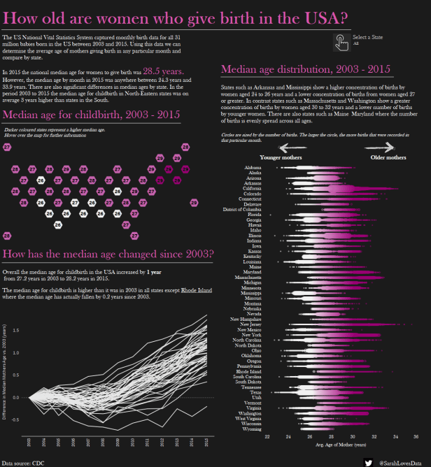
How old are women who give birth in the USA?
Published 17th August 2017 for #MakeoverMonday week 33 (2017)
This viz was published the same week that Andy and Eva launched the weekly ‘Viz Reviews’. I felt compelled to put my viz forward for review and was intrigued to hear Andy and Eva’s comments.
My initial viz looked nothing like the final version (I blogged about the full story here). Andy and Eva provided some great feedback during the Viz Review which I worked upon. However, after receiving their feedback I decided to make multiple changes, beyond what they had suggested. I ended up spending all afternoon working on this viz in a desperate attempt to make it ‘better’.
Andy even recorded a Tableau Tip Tuesday inspired by a question about dashboard actions I had asked during the Viz Review. Later I was able to work through the steps in his tutorial to update the dashboard actions in my viz.
(Click on image to view the interactive version in Tableau Public)
Much to my surprise this viz was selected as my first Tableau Public ‘Viz of the Day’ and went on to become ‘Viz of the Week’! This was a really proud moment for me and goes to show that the #MakeoverMonday Viz Reviews are really effective (but only if you use the feedback to iterate your vizzes)!
European Cities on a Budget
Published 2nd April 2018
I submitted this viz as my entry for the 2018 European Iron Viz feeder. I hoped by entering myself I would inspire more women to enter. I wrote about his viz previously in this blog post.
To my surprise this viz came third in the feeder competition, securing me a place in the live Iron Viz final at #TC18Europe! I was also selected as the Crowd Favourite prize winner. In short, I was completely overwhelmed at the response to this viz and it sparked an exciting chapter in my Iron Viz journey this year.
Click on the image to view the interactive version on Tableau Public
The best of the rest
Aside from my favourites there are other vizzes which are significant to me for various reasons. Here are a few of them.
An Actors Life: Alan Rickman
Published 12th September 2016 (as part of #MakeoverMonday)
This was one of the first vizzes I was really proud of. With this viz I experimented with various new techniques including BAN’s and circles. Considering I didn’t really know who Alan Rickman was at the time I enjoyed building this viz and I’m happy with how it turned out.
(Click on the image to view the interactive version in Tableau Public)
The Dutch Car Market
Published 8th May 2017 (as part of #MakeoverMonday)
With this viz I attempted to create a viz I had seen published by The Economist. I was really happy with how it turned out and blogged about my design process here.
Click on the image to view the interactive version on Tableau Public
Central Asia Institute – Tent Schools in Afghanistan
Published 2nd August 2017 (part of #VizForSocialGood)
This was my first proper viz for the #VizForSocialGood project. I blogged about my experience building this viz here. In this viz I experimented with different design techniques and layouts.
Click on the image to view the interactive version on Tableau Public
The UK Unemployment Rate
Published 5th January 2018 (part of the #SWDChallenge)
This viz was the first viz I submitted for the monthly ‘Storytelling with Data’ challenge, created by Cole Knaflic. Every month Cole releases a new data viz challenge. In January it was to create an annotated line chart.
I’m really happy with how this viz turned out and I always learn something new by participating in the #SWDChallenge.
Click on the image to view on Tableau Public
The Great American Income Gap
Published 16th January 2018 (as part of #MakeoverMonday)
This viz was published the same week that the ‘viz in tooltips’ feature was launched in Tableau. This is the first viz I built which utilised the viz in tooltip functionality and was later featured by Tableau Public in the Viz in Tooltip Viz Gallery. I was really pleased with how this viz turned out and I was proud to have my viz featured on Tableau Public.
The Flight of the Turkey Vulture
Published 24th January 2018 (part of #MakeoverMonday)
This viz signifies my first attempt at using Mapbox to build a custom map. In fact, on this occasion I couldn’t figure out how to build my own map in Mapbox Studio so I used one from their gallery of pre-made maps designs instead. I wanted the map to blend into the background so I made the background of the viz the same colour as the map.
I remember rushing to finish this viz. I had a #LondonTUG the same evening and wanted to publish this before I began my journey into London. I struggled with the placement of the labels (which are actually floating text boxes) on the chart as they kept moving when I published the viz to Tableau Public and became increasingly frustrated! Nevertheless I was happy with the final viz and it went on to be selected as my second-ever ‘Viz of the Day’.
Click on the image to view on Tableau Public

I was fortunate enough to have this viz featured in the ‘Viz Gallery’ at #TC18Europe too, a proud moment for me:

Big in Japan
Published 5th July 2018
I can’t mention my most significant vizzes without mentioning this one! This viz was built live on stage for the Iron Viz Europe competition in front of 2,000 people at the European Tableau Conference in London. This is also the quickest viz I have built on my Tableau Public portfolio since it was built in only 20 minutes!
You can read more about this viz and my Iron Viz Europe experience here.
All in all, it’s been an incredible journey and I look forward to the next 100 vizzes!
Thank you to everybody that has inspired and supported me on this journey. You know who you are.
Thank you also to Tableau Public for providing us with a platform to share our work with the world.
Thanks for reading.


