In March 2018 I entered my first Iron Viz feeder for the European Iron Viz competition.
For those unfamiliar with the competition, Iron Viz is the ultimate battle of Tableau skills. Three contestants are selected for a grand finale via viz contests held through Tableau Public. The contestants then go head-to-head in a 20-minute viz battle in front of a live audience at the Tableau Conference. While historically there was only one Iron Viz competition held every year at the main US conference, the European version of the competition was born in 2017. The format of the competition is exactly the same for both except there is only one feeder competition in Europe (versus three in the global competition).
My feeder viz
The Iron Viz feeder I entered was themed on European cities for which I submitted this viz (click on the image to interact with the full version on Tableau Public):

Why did I enter Iron Viz?
I entered Iron Viz because:
- I had never entered a feeder before and wanted to challenge myself.
- Female participation (and representation) in Iron Viz has historically been low. There hasn’t been a female in the main Iron Viz final since Kelly Martin in 2013 and the last (and only) female to win the competition was Anya A’Hearn in 2012. Female participation in the main Iron Viz competition was visualised by Ann Jackson in 2017 in this viz:

(Click on image to explore interactive version on Tableau Public)
Given the low representation of women in the competition I hoped I could encourage more women to enter by entering myself.
Oh no! I’m through to the final!
Once the feeder submission window closed I remember Lorna Eden asking me what I would do it I won. To be honest, I hadn’t really considered it. I didn’t for a second think I would make it through to the final. I wasn’t entirely happy with my viz and looking at some of the other entries I didn’t think I stood a chance of coming anywhere near the top three. Entrants put a lot of work into their feeder vizzes and as such the standard of the feeder vizzes tends to be exceptionally high. However, since there is only one feeder for the European competition (from which the top three winners are selected as finalists), there is a greater probability of getting through than with the main competition where only one winner is selected from each feeder.
I don’t think I’m alone in saying that many people enter the competition for the experience of taking part and not for the experience of getting through to the final. In fact, I think it’s fair to say many people forget there is another major stage of the competition for the lucky finalists. When I found out that not only was my viz in the top three-scoring vizzes but I had also won the crowd-favourite prize I was in a state of shock! I really hadn’t considered what I would do if I got this far and now it was actually happening!
Preparing for the final
There were approximately three-months between finding out we had been successful in the feeder round and the live finals. However, other than practicing Tableau and getting faster at vizzing there is little you can do prepare for the live competition until you receive the data set from Tableau. This year, Tableau tried something different and gave us the data a month in advance (usually it’s provided a matter of days before the live competition). However, there was another twist!! We would have to use Tableau Prep to ‘clean’ the data set provided and bring in additional data (if we felt necessary). Given Tableau Prep was only released in April 2018 it was brand new to all of us so required us to learn the basics first. Thankfully Tableau Prep is quite intuitive and easy to pick up.
The dataset
The dataset provided by Tableau was The Economist’s ‘Big Mac Index’ data from 2000 to present. The Big Mac Index looks at the price of a Big Mac burger in each country where it’s sold and compares the prices across countries. This can then be used to calculate the under or over valuation of currencies versus the US Dollar and other major currencies as an alternative measure of Purchasing Power Parity.
The Economist traditionally visualise the Big Mac Index in a dashboard similar to the one below:
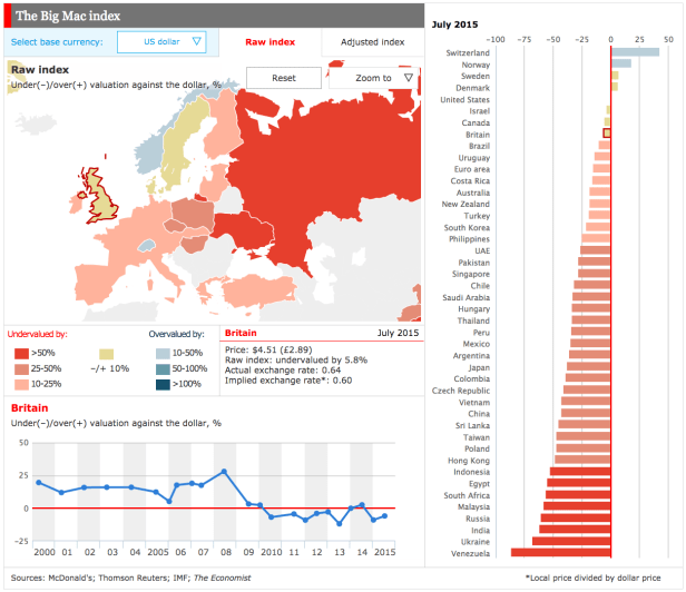 Source: The Economist
In broad terms, a Big Mac should cost the same everywhere since it is produced in the same way using very similar ingredients across the world. However, in reality this is not the case and external factors such as property rent, the cost of labour and taxation often impact the final cost paid by the customer.
My approach
I initially spent a week or so researching the Big Mac Index to ensure I fully understood the data and what it was telling me. I read multiple articles about the index, mainly trying to grasp the why; why were currencies over or under-valued, why does the Big Mac cost more/less in certain countries, etc. I found multiple datasets I could compare the Index to; obesity rates, minimum wages, the number of McDonalds restaurants per country, population counts, GDP per capita, and so on. However, I struggled to find a strong story. As you would expect, the Big Mac is more expensive in countries with a higher GDP per capita. These countries also tend to pay their staff better and may have statutory minimum wage agreements in place. My initial idea was to focus on Europe and calculate how many Big Mac’s citizens earning the minimum wage can purchase per hour. This helps put the data into context and provides a good insight into how much it costs to live in each country. However, I began to realise there wasn’t much of a story there. Despite trying to approach the data from multiple angles I didn’t seem to be getting anywhere. On the Friday before the competition I took the tough decision to re-start my viz from scratch with a completely different focus.
Big in Japan
From all the research I had been doing I noticed Japan was a bit of an outlier. While Japan has one of the lowest obesity rates for a developed country in the world, it is also extremely fond of McDonald’s. Japan has the second-highest number of McDonald’s restaurants anywhere in the world (after the US). McDonald’s in Japan has also had an interesting time since 2012 with various struggles impacting their sales and resulting profitability. As I read more into the data I found multiple stories I could use to build a viz so this is the angle I decided to take. Furthermore, the Economist calculate the Big Mac Index versus the Yen so I felt this was a less-obvious angle to take rather than using the standard US Dollar comparison.
In terms of design I knew I wanted to keep things simple. I kept to four colours; red, grey, black and white and used red to highlight Japan only. I also stuck to simple charts; bar charts, area charts and line charts (using regular and stepped lines). For additional insight I utilised viz in tooltips and include a dashboard action too. To keep my viz build time down I pre-built the dashboard title in PowerPoint and saved it as a png (bringing it into Tableau as an image). I also pre-wrote all my chart titles and sub-titles and copied/pasted these from Notepad. I’m so glad I did this because I was shaking so much during the live show I struggled to use the mouse, let alone type!
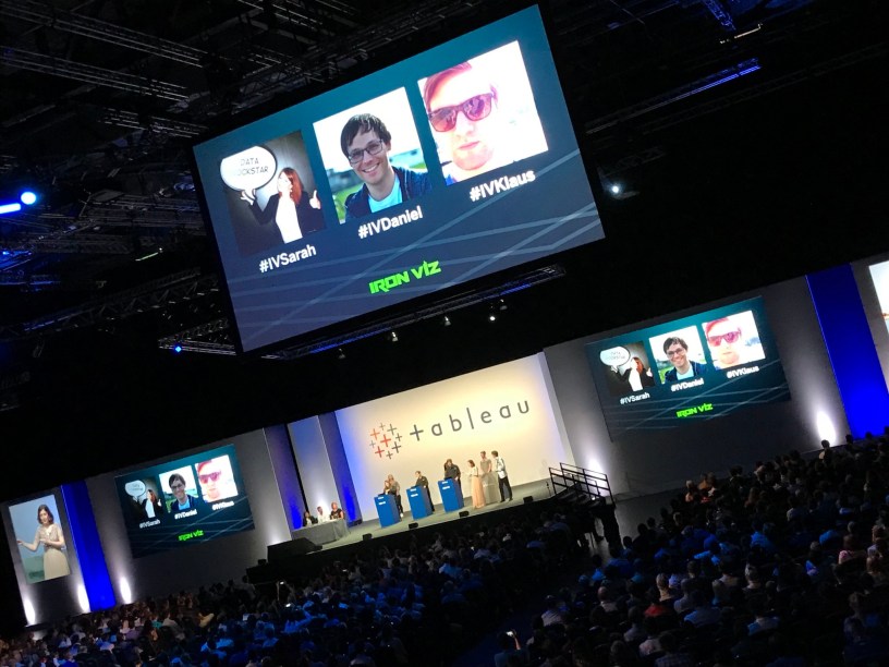
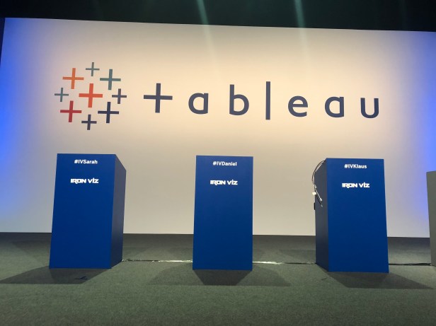
The live show
In the lead up to the live show at the Tableau Conference Europe 2018 (#TC18Europe), contestants were required to participate in a few dress-rehearsals. These really helped us to get familiar with being on stage and the general flow of the event. We did a full run-through shortly before the live show (without an audience) so the live show almost felt like a repeat. However, as soon as you see the podiums with the names on it suddenly becomes very real!
Despite previous Iron Viz contestants telling me that I would be shaking with nerves on stage and would find it difficult to type I didn’t really believe them. However, I was shaking so much I struggled to use the mouse! Thankfully I didn’t need to do much typing as I had pre-written the majority of my dashboard text and was able to copy it straight into Tableau. When I checked my FitBit after the event and noticed my heart rate had reached 126 bpm during the live show!!
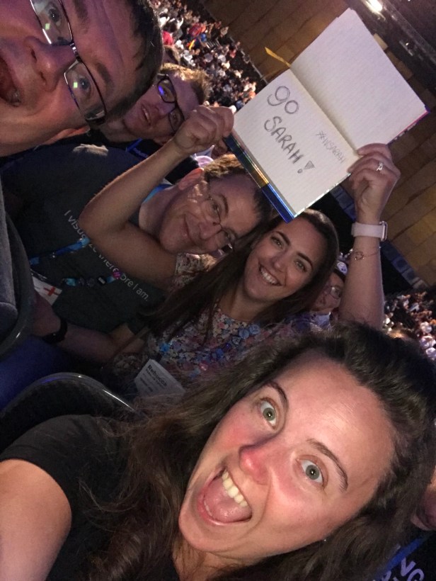
The experience of being of stage was great and it was extra special having my crazy ‘fan’s’ cheering me on in the front row. Thanks guys!
Overall it was a great experience and I thoroughly enjoyed it. It was fun to work with such a great group of talented people including the hosts Louis Archer and Jade Le Van, the Sous Vizzers; Saskia Van Daal, Tom Christian and Archana Ganeshalingam, my fellow contestants; Klaus Schulte and Daniel Caroli and of course the awesome judges; David Pires, Anya A’Hearn and Rafi Zelikowsky.
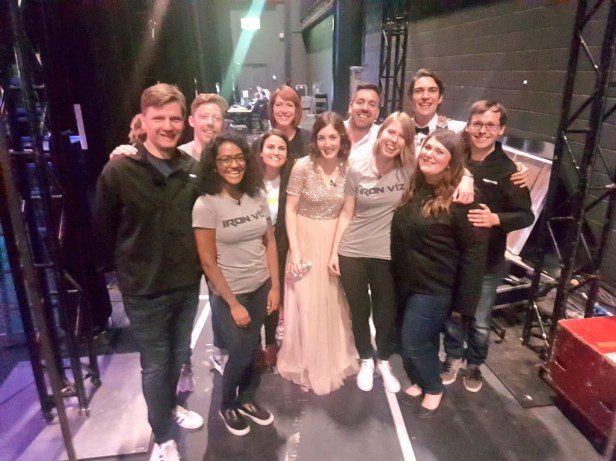
Here’s a picture of us all backstage just before go-live taken by Andy Cotgreave! Do we look nervous??
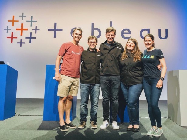
Congratulations to the winner Klaus Schulte and fellow contestant Daniel Caroli. It was great working with you both! Also, a big thank you to #MakeoverMonday, in particular Andy Kriebel and Eva Murray. I think it’s fair to say that without this project none of us would have made it to the final!
It was great to share the moment with you both!
The Viz
Here is the viz I built in 20 minutes during the live show. Click on the image to interact in Tableau Public:

And if I’ve inspired you to enter Iron Viz yourself…….
Tips for Future Iron Viz Participants
1) Start early
As soon as you find out you have won a feeder there are things you can do to start preparing yourself for the final. Try to get faster at Tableau, learn the keyboard shortcuts and study viz best-practices. This blog post by previous Iron Viz finalist Joshua Milligan should help too: https://vizpainter.com/the-need-for-speed-how-to-build-tableau-visualizations-quickly/
2) Do your research
Once you receive the dataset from Tableau start reading about the topic and improve your knowledge as much as possible. This will help with your ability to tell a good story with your data. Also, look at previous winning vizzes. How did the author arrange things on the dashboard? What size dashboard and fonts did they use? Did they use any dashboard actions or the pages shelf? Chances are the author will have laid things out in a big screen friendly manner with the audience in mind. Study what they did and learn from it
3) Find a story
The story you tell is just as important as the viz itself. You’ll need to explain your viz to your audience and exactly what it is showing. If you can explain the story behind it by adding additional facts and background information your audience (and judges) are more likely to engage with the your viz.
4) Pick your charts wisely
When deciding on charts to include in your viz, don’t go with anything too complex. I’m not saying don’t pick a non-traditional chart type but remember you’ll only have 20 minutes to build your entire viz. You’ll need to use your time wisely and more complex chart types might be out of the question if you can’t build them quickly.
5) Consider how things will look on the big keynote screens & what will appeal to your audience
Remember you are building a viz that will be displayed on large keynote screens and not your standard laptop or meeting room screen. The audience will struggle to see small text and very light colours. In our rehearsals I think Klaus, Dan and I all made slight changes to our vizzes once we saw them on the big screens. I had a light-grey shaded area chart that looked like a regular line chart on the big screen. Dan also had some text that was small and difficult to read from the back of the keynote theatre. Also consider your colour palette and which colours will make the most impact. Klaus used bold colours that grabbed the audience’s attention while Dan and I used more subtle colour palettes.
6) Practice, practice, practice….and practice some more
I can’t emphasise this enough. You need to practice your viz until you can practically build it blindfolded. Document your steps, memorise which pills you have on which shelves and any formatting. A large part of the practicing stage will involve getting your build time down to a decent time. I would suggest aiming for a build time of approx. 15 minutes to give yourself some flexibility. No matter how quickly you can build the viz in your practice sessions it will be completely different during the live show. Your hands will be shaking and the simplest of tasks will be more difficult than usual.
7) Get to know your Sous Vizzer
I was lucky enough to have Saskia Van Daal as my Sous Vizzer. Anyone that was in attendance at the opening keynote at #TC18Europe will have seen Saskia do an incredible job of keeping her cool on stage while trying to do a live demo of Tableau’s Web Authoring capabilities with no internet connection! I was fortunate to have the opportunity to meet Saskia in person a few weeks before the final. We then kept in contact regularly and shared ideas right up until the big day. Saskia’s feedback was really important to me and helped shape my final viz.
8) Plan your talk and how you will explain your viz in advance
Not only do you need to practice the building of your viz but you’ll need to practice your talk. After you’ve built your viz on stage you’ll be given the opportunity to talk through it with the audience. This is your opportunity to explain the background to your viz, what you did and show off any Tableau features you have utilised which aren’t immediately obvious such as dashboard actions or viz in tooltips. Plan what you are going to say in advance and ideally run through it with somebody in advance you so can get their feedback and tweak as necessary.
9) Keep your cool on stage
Yes it will be scary being on stage in front of 1000’s of people. However, try not to get too overwhelmed. Focus on the task at hand and try to pretend the crowd aren’t there. You’ll find you’re so focused on building you viz that you’ll quickly forget all about the crowd and what is going on around you.
10) Have fun!
You’ve earned your place on the stage! Enjoy the moment, whatever happens!
Previous Iron Viz winner Curtis Harris also has a great blog post on Iron Viz tips which you can read here.
Thanks for reading.
