Welcome back!
Thank you to everyone who took part in our recent Women-themed project. Read the recap post here.
We’re excited to return with a new theme to see us through the summer months, in the Northern Hemisphere at least!
New Here?
If you’re new to Iron Quest, first let me explain what this project is about!
Iron Quest is a monthly community-led data visualisation project which follows a similar format to the Tableau Iron Viz feeder competition. Founded in 2019, Iron Quest has received over 750 entries and remains one of the only community projects where participants ‘bring their own data’, similar to how you would for Iron Viz. Participants have around a calendar month to source a suitable data set and design, build and submit a data visualisation.
Each submission should use a data set that touches upon the chosen theme for that month and every viz should aim to showcase best practices & skills in design, storytelling & analysis; the same judging criteria as Iron Viz.
If desired, participants can opt-in to receive feedback along the lines of design, storytelling and analysis from myself and other guest hosts. Once the submission period has closed we will review the visualisations submitted together and provide feedback to those who have requested it. There will also be a wrap-up blog post after every round.
Iron Quest aims to give individuals an opportunity to practice their data sourcing, data preparation and data visualization skills without the pressure that comes with participating in a competition like Iron Viz. With Iron Quest, there are no winners nor prizes, thus removing the competitive element.
The Theme
I’m excited to announce this month’s Iron Quest theme is Maps!
This is the second time we’ve covered Maps – the first time was back in February 2020. There have been plenty of new mapping features released in Tableau since 2020 so a lot more is possible now.
What’s more, this Iron Quest will coincide with the brand-new Data + Maps TUG! We’ll be sharing some of the entries from this round at their inaugural (virtual) meeting on August 28th. To be in with a chance of being featured, all you have to do is submit a viz!
Sign up for the Data + Maps TUG here.
The maps theme is slightly different as we’ll be focusing on a chart type, rather than a specific topic this time. That being said, the data you choose can be on any topic you wish. However, your viz must include at least one map. This is a great opportunity to experiment with some of the newer mapping features in Tableau or even experiment with building your own map styles in Mapbox! The choice is yours.
Viz-spiration
For inspiration, consider the following vizzes that feature maps:
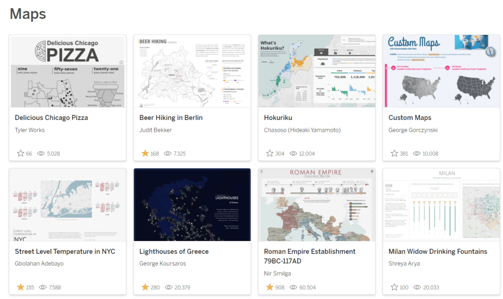
Map Viz Gallery on Tableau Public
This collection showcases a diverse range of beautiful maps created by the Tableau Community
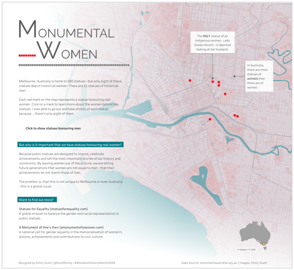
Monumental Women by Kimly Scott
In this viz, Kimly looks at data on the number of statues in Melbourne, Australia, where they are located, and how many honour women.
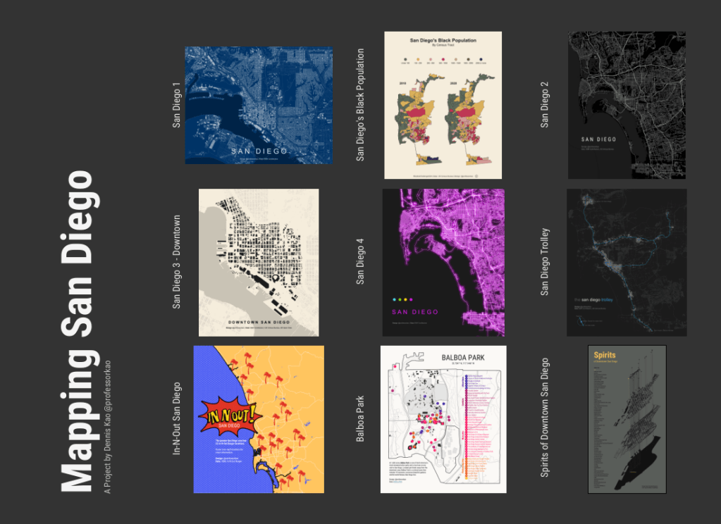
Mapping San Diego by Dennis Kao
In preparation for Tableau Conference 2024, Dennis shared a series of beautiful map vizzies focused on San Diego. Review them all here:
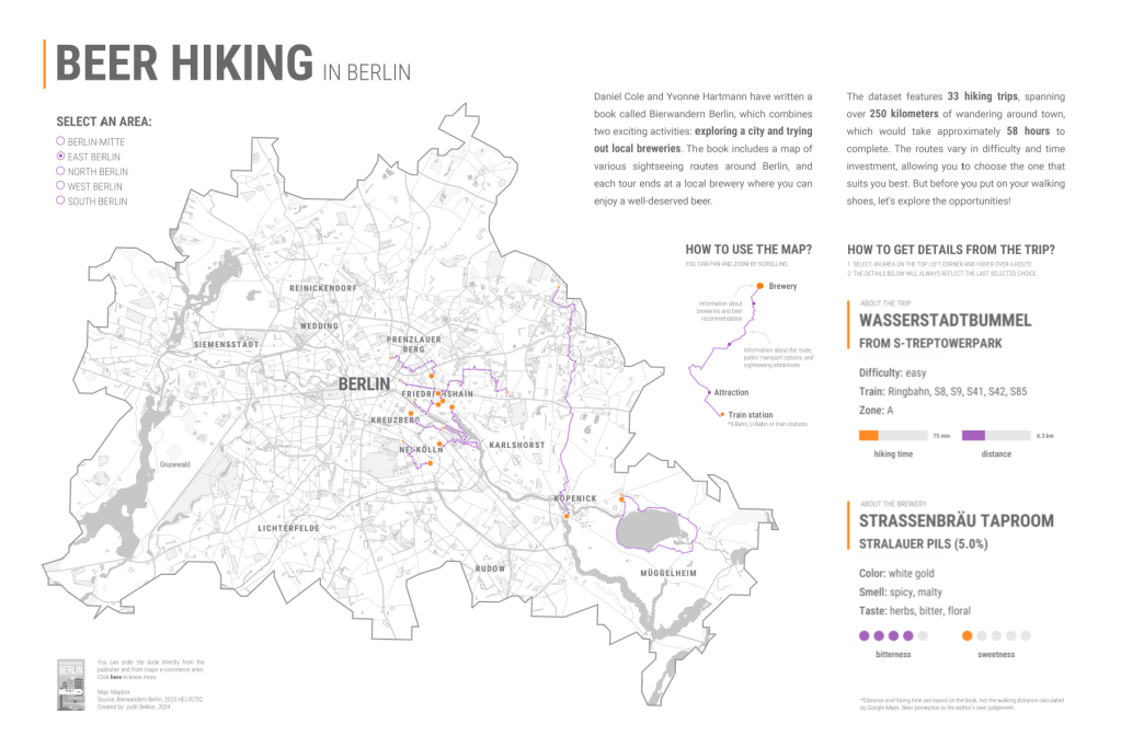
Beer Hiking in Berlin by Judit Bekker
In this viz, Judit vizzes 33 hiking routes in Berlin, with each route featuring breweries you can visit along the way!
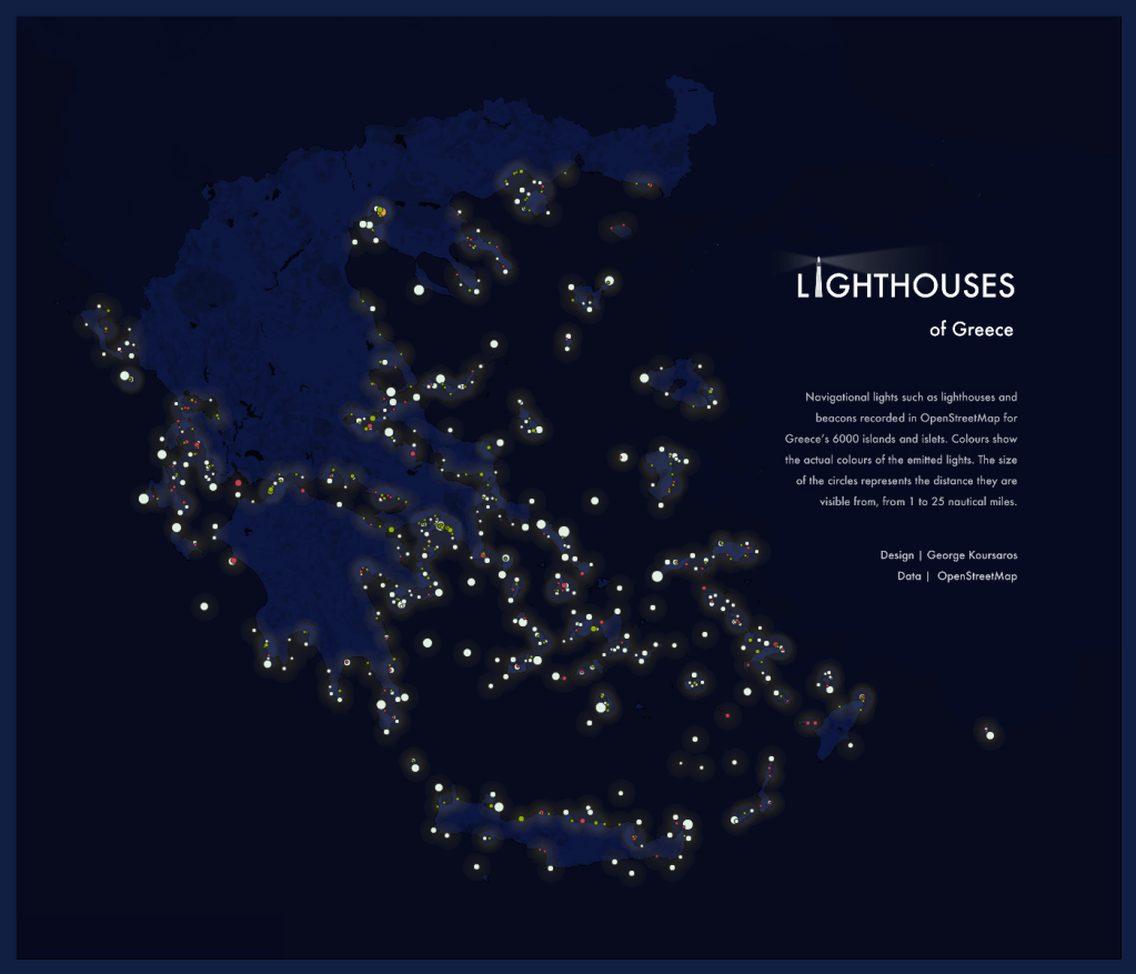
Lighthouses of Greece by George Koursaros
In this viz, George maps the location of 6,000 lighthouses across the Greek Islands.
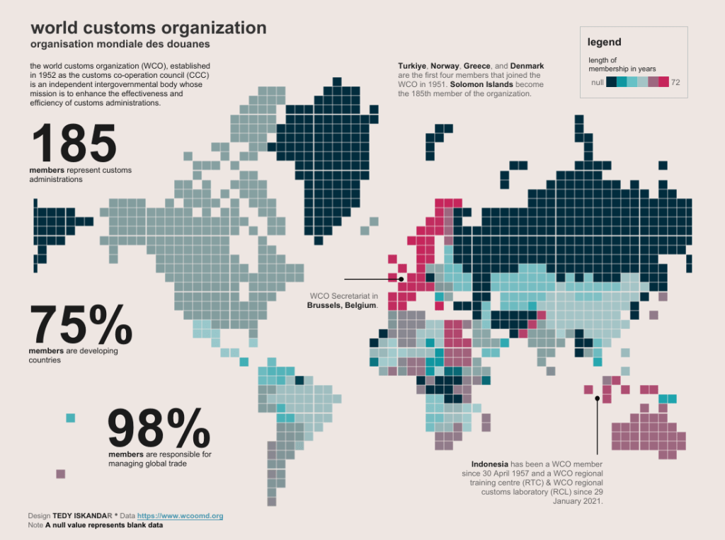
World Customs Organisation Members by Tedy Iskandar
In this viz, Tedy uses a square tile map to visualise membership of the World Customs Organisation, by country and length of membership.
Data Source Ideas
For data source inspiration, we encourage you to check out the following sites:
- Free GIS Data Sets – everything from arctic permafrost maps to gridded population data
- ArcGIS Hub – search and download data shared by thousands of organizations around the world
- HumData – The Humanitarian Data Exchange
- Eurostat – European Statistics
- World Bank Open Data
- Public Geo Data for the UK
- CDC – Centres for Disease Control and Prevention
- Data is Plural – a weekly newsletter of useful/curious datasets, published by Jeremy Singer-Vine. There have been 309 editions to date. All of the datasets are saved to a Google sheet for easy reference.
- Flowing Data by Nathan Yau – a collection of datasets covering a broad range of topics
- Information is Beautiful – a collection of datasets compiled by the Information is Beautiful team covering a range of topics. They also have an additional collection of datasets used to drive the visualisations in the Beautiful News book.
- Public Data Sets – a list by Cole Nussbaumer Knaflic – a list of places to find free, publicly available datasets.
- Makeover Monday – a collection of over 350 data sets from previous Makeover Monday challenges.
How do I enter?
The process is simple:
- Source your data and build a viz, using at least one map in your design
- Upload your viz to Tableau Public or somewhere it can be openly viewed online.
- Fill in the submissions tracker (embedded at the bottom of this post) so we can keep track of who is participating. This step is essential if you want feedback or to be credited in the wrap-up blog post.
- If you opted in for feedback, the co-hosts and I will provide some constructive feedback on your viz after the submission period closes.
Top Tips
- You can use any data set (assuming you have permission to share it publicly).
- Always remember to credit your data source/s on your viz.
- Refrain from using any images or logos on your viz unless you have permission to do so.
- Remember the Iron Viz judging criteria and try to focus on all three; Design, Storytelling and Analysis.
- Think outside the box!
Meet the Co-hosts
I’m excited to announce that I’ll be teaming up with the leaders of the brand-new Data + Maps TUG this month! My co-hosts are active voices in the community, passionate about maps, and frequently share inspirational vizzes on Tableau Public.
Details of the inaugural Data + Maps TUG will be announced soon!

Tedy Iskander
Tedy has a unique style to his vizzes. He mainly focuses on maps in a desktop layout that are effective and insightful. His viz “Fishing Spot in Indonesia” was featured as #VizOfTheDay, and he was featured in Tableau Next 2023 – 55 people nominated by the community and not yet recognized as an Ambassador or Visionary by Tableau.
Tedy’s vizzes are usually centred around Indonesia, where he’s from; a rare and interesting sight on Tableau Public! Tedy also co-leads the Jakarta TUG.

Tore Levinson
Tore works as a Tableau Jedi in Inmeta Consulting, Bergen, Norway.
Tore is a Tableau Jedi with experience since version 7.0 (2012). He’s one of Europe’s most merited Tableau Trainers, with over 3.500 people trained in 16 countries.
He’s also the leader of TUG Norway and a 3x Tableau Ambassador. He was the co-host of Vizit London and Vizit Berlin.
He’s been working with Tableau since filled maps and area charts were introduced. He has over 70 Tableau t-shirts/hoodies and a growing swag compilation! In his spare time, he supports Liverpool FC and is a soccer coach for kids.

George Koursaros
George is a Data Visualization Analyst and Tableau Public Ambassador, originally from the sunny island of Cyprus and now living in Switzerland.
He is passionate about all things data, with a special love for data visualization, compelling data storytelling, and data art. Beyond the data realm, he loves movies, music, animals, exploring new destinations and spending time outdoors – all of which often find their way into his visualizations!

Dennis Kao
Dennis is a social work professor at Carleton University, where he conducts health equity research and teaches courses on community practice, nonprofit management, and research/statistics.
With over a decade of experience in statistical analysis and GIS mapping, he first discovered Tableau in November 2020 and immediately fell in love. Engaging with the #DataFam and getting involved with community projects have invigorated his passion for working with data.
Today, he considers himself an aspiring data visualization designer and is learning to integrate data visualization and Tableau into his own teaching and research. He is currently serving as a Tableau Visionary and Public Ambassador and co-leads the Healthcare TUG, University Teaching & Learning TUG, and EduVizzers community project.
When is the submission deadline?
The deadline for submissions is midnight PST on Sunday, August 11, 2024.
Please use the submission form below to submit your entry.
- Feedback will be provided (to those who request it) via a conversation recorded and posted to YouTube between the co-hosts and me in August.
- On the submissions form you can specify if you require feedback focused on the Iron Viz scoring criteria (design, storytelling and analysis) or more general data viz feedback.
- Please note, that if we receive a large number of feedback requests (more than we can cover in two hours), we’ll prioritise those from Tableau beginners or those entering #IronQuest for the first time.
Continue the conversation and connect with other participants by following the #IronQuest hashtag on Twitter (X) and LinkedIn.
Look out for the feedback video and recap blog post after we complete this challenge!
Thanks for reading and we look forward to seeing your entry!
