
Last week I had the pleasure of participating in the Tips Battle at Tableau Conference (TC24).
Despite leading this session in the past, I’ve never actually been in the hot seat presenting tips before! In fact, this was my first time presenting Tableau tips on stage!
Hosted by Jennifer Dawes and Jade Corley, it was a competitive, Harry Potter-themed session with eight contestants – all well-established names in the community, plus Lisa Trescott and Kevin and Ken Flerlage as judges.
I was fortunate to make it to the second round, losing out to amazing Kimly Scott, who went on to win the battle! Congratulations, Kimly!

If you missed the session, you can watch the recording on Salesforce + here.
A few people have asked me to share my tips in more detail so I’ve documented them below.
Please refer to the accompanying workbook here.
I hope you find them useful!
Disclaimer: I learnt these tips from the amazing Tableau Community! Where possible, I’ve credited the author/s who shared them originally.
Tip #1: Assign Highlight Colours to Palette
Let’s assume you want to highlight a mark in a viz, muting the other marks in the process. You could do this manually by assigning specific colours to the marks, but there’s a quicker way!
Simply right-click the mark you want to highlight in the colour legend and select “Assign Highlight Colours to Palette”.

Once applied, these colours can be reused across the workbook.
Originally shared by Jeffrey Shaffer
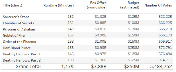
Tip #2: Eliminate the Grand Total Bar
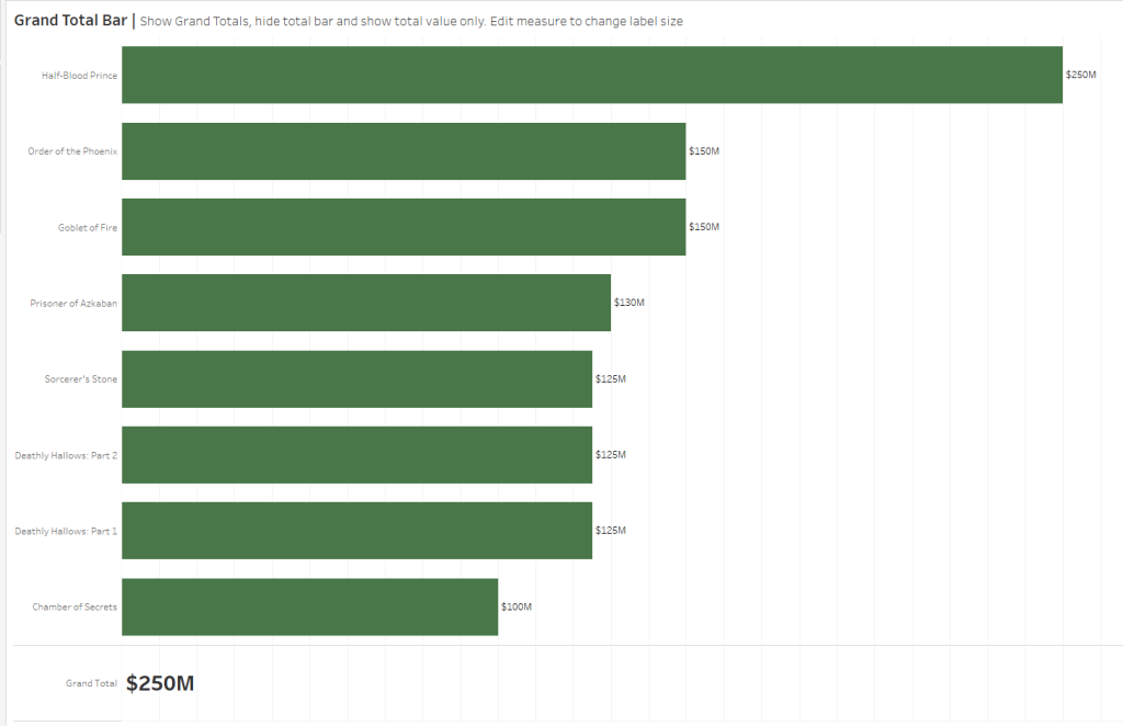
Sometimes, adding a Grand Total bar to a bar chart makes the chart difficult to read, truncating the bars to accommodate the Grand Total bar.
To avoid this we can eliminate the bar and show a label instead. Here’s how:
1. Build a bar chart and show the Grand Total:
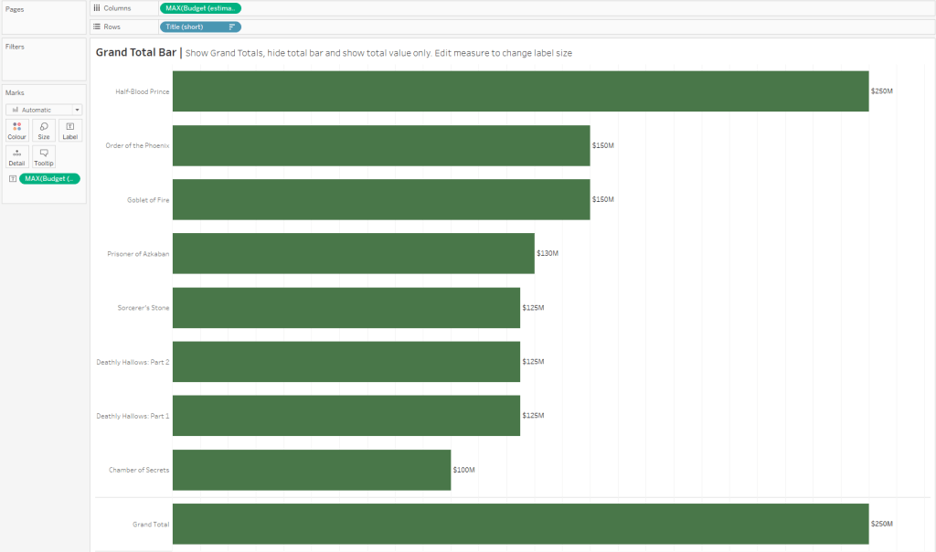
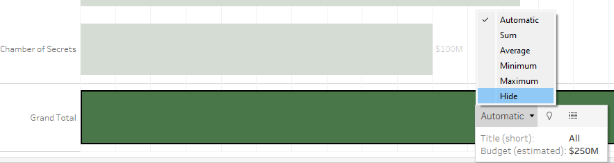
2. Select the Grand Total bar and select “Hide” from the drop-down menu:
3. To show the label, select the measure pill on the columns shelf and select “Format”. From the Format menu on the left, select “Pane”, then under the “Special Values (e.g. NULL)” section, select “Marks: Show at Default Value”:

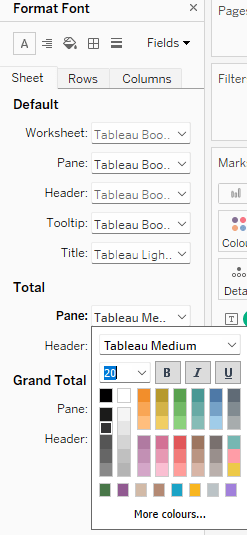
4. To increase the size of the label, select the measure pill on the columns shelf again and select “Format”. Select “A” from the icons at the top to edit the fonts. Under the “Total” section, adjust the “Pane” settings to use a larger font for the Grand Total label.
Here is the finished result:
Originally shared by Ivett Kovács as part of the #BigLittleTips series.
Tip #3: Change Grand Total Default Aggregation
Imagine a table showing multiple measure columns, each with a Grand Total.
The default Grand Total for each column will be the aggregation used in that column, i.e. SUM. However, sometimes these aggregations won’t make sense at the Grand Total level.
To overcome this, we can change the aggregation of each Grand Total column separately.
Simply select the Grand Total you want to adjust and pick the correct aggregation from the drop-down menu:

Originally shared by Ivett Kovács as part of the #BigLittleTips series.
Tip #4: Multi-Format Reference Lines
Imagine you have a chart with multiple reference lines that you need to format:

Instead of formatting them one at a time, you can actually format them all at once!
Simply Ctrl + Left-Click (or Command + Left-Click on a Mac) to select all of the lines you want to edit, then on the final reference line select “Format”.
Any formatting changes will be applied to all selected reference lines:
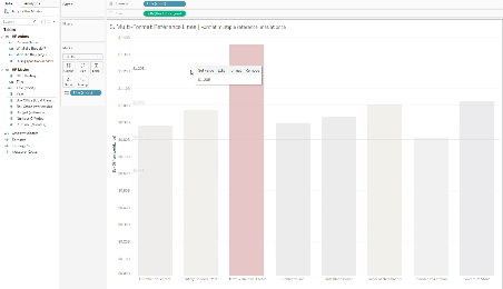
Originally shared by Tore Levinsen on Twitter.
I hope you found these tips useful!
Sarah
