Hello, #IronQuesters! We are happy to be back with our first post of the year!
As you may recall, #IronQuest recently teamed up with Dinushki De Livera and Jennifer Dawes from #HerData to co-host the ‘Weird or Wonderful’ round.
For this round, we were expecting fun, heartwarming, beautiful, unusual or downright strange vizzes and viz topics! As usual, our participants did not disappoint! We received 15 submissions for this round and welcomed 10 first-time participants to the project!
Seeing the diverse range of topics covered and the creativity shown throughout the entries was fantastic! We received more wonderful vizzes than weird but with a topic so broad, no two entries were the same. Many participants opted to explore curiosities like “Why does my French Bulldog fart so much?” or which flavour is the most common in Welch’s Mixed Fruit Snacks while other participants chose to celebrate achievements including personal fitness journeys and the careers of famous people.
Feedback
The #HerData team and I provided feedback to everyone who requested it during our conversation, now posted on YouTube. We had a lot of fun going through the entries and exploring the variety of topics covered.
You can listen to our feedback here:
We reviewed the vizzes in alphabetical order, by first name. The video is split into chapters to make it easier for you to jump to vizzes of interest.
We covered vizzes by the following authors, reviewed in this order:
Aakarsh
Brittany Rosenau
Candice Che
Caroline Swiger
Dipa Rajagopal
Harshavardhana Naganagoudar
Jessica Moon
Lucia Stefanuto
Patrick Sarsfield
Priya Yogendra Rana
Vasanthan Vidthyan
Now, lets explore the entries!
THANK YOU to everyone who submitted entries for taking the time to create and share your work! Also, a big thank you to Dee and Jennifer for being fantastic co-hosts.
All entries are posted below in alphabetical order by author’s first name. If you tweeted your viz or thought you submitted one via the Google Form but don’t see it here, let us know and we’ll work to include any additional entries ASAP.
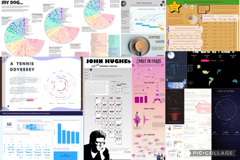
Aakarsh – A Tennis Oddessey
For this quantified self viz, Aakarsh illustrated his Tennis journey, going from a beginner to an advanced player with consistent practice over a 6-month period! I like how Aakarsh included an alternative display option in this viz, along with plenty of additional context in the tooltips to help the audience connect with his personal journey.
Ann Pregler – A Walk in the Dark
In this viz, Ann visualised every spacewalk on NASA missions from 1965 – 2013. This striking viz uses a chord diagram to visualise who walked with who and how long each astronaut spent on EVAs (Extra-Vehicular Activities).

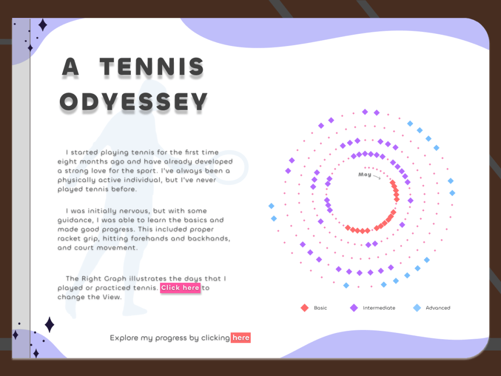
Brittany Rosenau – Flavor Distribution across 50 Fruit Snack Packs
For this viz, 2023 Iron Viz Finalist Brittany analysed the distribution of flavours found across 50 packs of Welch’s Mixed Fruit Snacks. Her business-style dashboard approach provided a way for her to display her findings clearly and effectively, whilst her insights show the most popular flavours and how often they appeared.
Candice Chi – Cat’s Secret Life
In this viz, Candice visualised the results of ‘The Cat Tracker Project’ conducted by Adelaide University in Australia. The project tracked 350 pet cats using GPS collars to better understand their daily movements. I like how Candice focused on the story of one cat in particular, Badheera, uncovering his interesting movement patterns in the process!

Caroline Swiger – Unidentified: 30 Years of UFO Sightings
In this extensive viz, Caroline visualised US UFO sightings data from 1991 to 2021. Caroline provides a deep-dive analysis into the dataset, uncovering interesting insights including the most common times of the year for sightings, where they occur the most, as well as the different shapes the witnesses report to have seen.

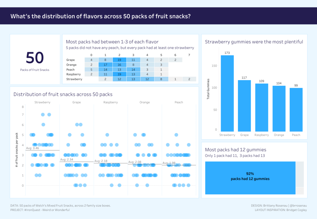
Dipa Rajagopal – USA – Top 50 Fast-Food Chains
In this viz, Dipa looked at sales data from the top 50 fast food chains in the US (based on turnover in 2021). The viz is packed full of interesting facts and insights!
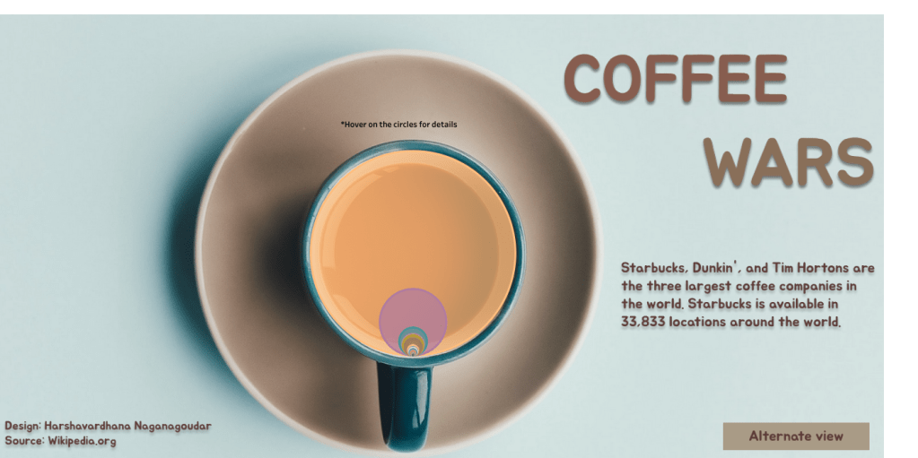
Harshavardhana Naganagoudar – Coffee Wars
In this viz, Harsh utilised two views to visualise the number of locations the most popular coffee chains have around the world. Can you guess which chain has the most locations?
Jessica Moon – Emily in Paris
In this fun viz, Jessica visualised a variety of data from the popular Netflix show, Emily in Paris. I particularly like how Jessica used innovative viz techniques aligned to the subject matter to display insights, including a chart within the Eifel Tower and a violin plot used to mimic a dress! Plus the annotations in this viz are particularly effective in adding additional context and insights to the underlying data.
There’s a lot packed into this viz, including some impressive tooltips. I highly recommend you check out the interactive version!

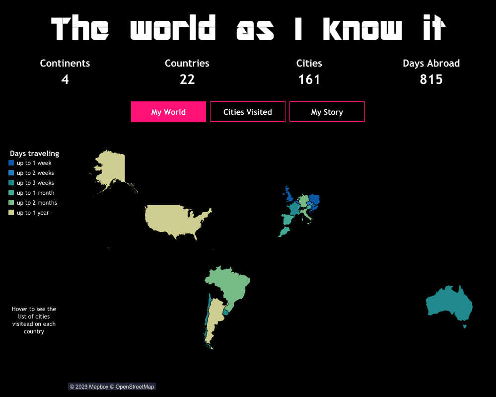
Lucia Stefanuto – The World As I Know It
In this living viz, Lucia created the equivalent of a scratch map in Tableau to visualise all of the places across the globe she has visited! Rather than simply including a map, Lucia also shared additional views to help tell her travel stories and to add context to the data. What’s great is, this viz can continue to be updated as Lucia continues her travels!
Patrick Sarsfield – John Hughes: Films Defining a Decade
In this viz, Patrick visualised the career of legendary filmmaker, John Hughes. I love the design of this viz! Patrick utilised small multiple icon charts to visualise various attributes of each film, including plenty of nuggets only a true John Hughes fan would know! There’s a lot packed into this viz, including some impressive tooltips. I highly recommend you check out the interactive version!

Priya Yogendra Rana – Man vs. Food
In this viz, Priya visualised data on the eating challenges covered in the popular TV show, Man vs. Food. Priya used her viz to highlight which challenges were successfully completed by the host and which ones the food won. At the bottom, you can even take a look at some of the dishes sampled in the challenges!

Tyler Stevenson – Visual Resume
In this viz, Tyler visualised his resume, including his skills and career history to date. A visual resume is a great way to showcase your Tableau skills and can serve as a powerful resource when job seeking!

Vasanthan Vidthyan – The Evensong Cup
In this viz, Vasanthan visualised data from the Evensong Cup. In 2020, connoisseurs of church choirs convened on Twitter to determine the most-loved piece of music in a knockout tournament, the results of which are visualised here. The viz tracks various attributes of the composers included, including their gender and nationality, as well as a deep-dive into the results of the tournament!

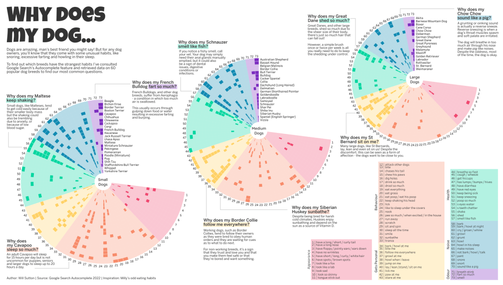
Will Sutton – Why Does My Dog….?
In this Viz of the Day, Will consulted Google Search’s Autocomplete feature to retrieve data on 60 popular dog breeds and discover the most common questions their owners have about their behaviour or strange habits. This viz is packed full of interesting takeaways and (often hilarious) insights into interesting dog behaviours. I love how Will used annotations to draw the reader in and highlight some well-known but amusing behaviours.
Thanks again to everyone who participated in this round.
We will be launching a brand-new #IronQuest project next week! Stay tuned for more information.
In the meantime, stay up to date with all things #IronQuest by following the hashtag #IronQuest on Twitter and LinkedIn.
Check out the Iron Quest section of my blog for details of the latest projects and how to participate.
Thanks for reading.
