For the May to June period, the #IronQuest theme was Quantified Self.
For much of this time we were battling the global Coronavirus pandemic, with Government imposed lockdowns in place across the world. As a result, daily routines were turned upside-down and many people were juggling working from home at the same time as caring for children or relatives. With these things in mind, I thought it would be an interesting time to start tracking data about our lives and visualising the results.
Little did I know how popular this topic would be!
We received a total of 62 submissions for this round making it the most popular round in #IronQuest history, completely smashing the previous record of 39 entries we received for the mapping round! What’s more, 43% of entrants were first-time #IronQuest participants and 78% had never entered an Iron Viz feeder before!
I was privileged to join forces with Tableau Public Ambassador Ivett Kovács this month. Ivett works as a senior data visualization developer and designer at Starschema in Budapest, Hungary. Ivett has helped some of the most well known companies use data to make more effective decisions, solve tough problems and increase effectiveness. Ivett’s Tableau Public portfolio is filled with impressive, well-designed vizzes and it was an honour to have her on the project this month.
Thank you, Ivett for your help and contributions to the project!
Feedback
Due to the high volume of entries this month, Ivett and I were unable to cover all of the vizzes where feedback had been requested on our feedback call.
In the essence of time we prioritised feedback for first time entrants or those who have been using Tableau for only a short period of time.
You can listen to our feedback here:
In this video we cover vizzes by the following authors:
Alex Johnson
Autumn Battani
Caitlin McCluskey
Cheryl Tan
CJ Mayes
Dang Ho
Liam Spencer
Madalina Andrei
Max Miliano
Natalia Miteva
Priya Padham
Sedale McCall
Taimoor Malik
In order to provide more feedback, I called upon my friends Zach Bowders, Mark Bradbourne and Kevin Flerlage for assistance in providing written feedback to those who requested it (for vizzes we didn’t cover in the call). I emailed this feedback to participants directly.
Thank you for your support, Zach, Mark and Kevin!
If you have not received feedback and would still like your viz to be reviewed, please let me know.
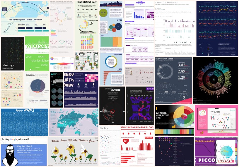
Viz Highlights
I was surprised in the diversity of entries we received this month. Participants really made the topic their own by visualising data on everything from health and fitness to personal finances.
Here are a few of my favourite entries. Click on the viz images to view the originals on Tableau Public
A few authors opt to visualise data on motherhood. In this example, Agata tracked and visualised the number of times her children said variations of the word ‘Mom’ throughout a week. I think any parent can relate to this data but the insights are what make this viz so beautiful. For instance, “F” calls for his Mother more frequently around meal times:
 Mom! by Agata Ketterick
Another motherhood data viz was submitted by Louise.
In her viz, Louise tracked the number of times she breastfed her baby in the first six months, as well as the times of the feeds. This viz beautifully demonstrates just how demanding newborn babies can be with feeds at all times of the day and night! It’s interesting to see how the feeding patterns change as her baby grows older too.
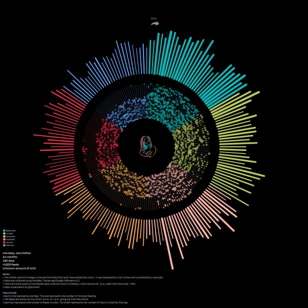 Breastfeeding by Louise Shorten
Many authors chose to visualise data relating to their daily habits during the quarantine period.
In this example, Alexander visualised the number of times he left the house during the UK lockdown period. The design of this viz is striking and I found it interesting to see how his habits changed as the lockdown progressed:
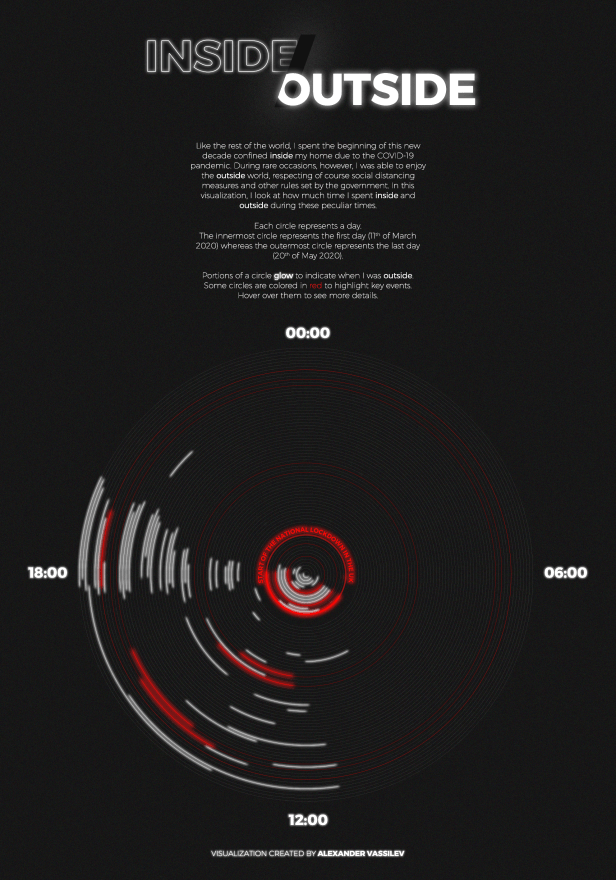 Inside Outside by Alexander Vassilev
As virtual communication became the primary method of keeping in touch with others outside of our households in the lockdown period, Max tracked his virtual interactions over a four-week period during lockdown.
I really like how Max took inspiration from the Dear Data postcards designed by Stefanie Posavec and Giorgia Lupi to visualise his data:
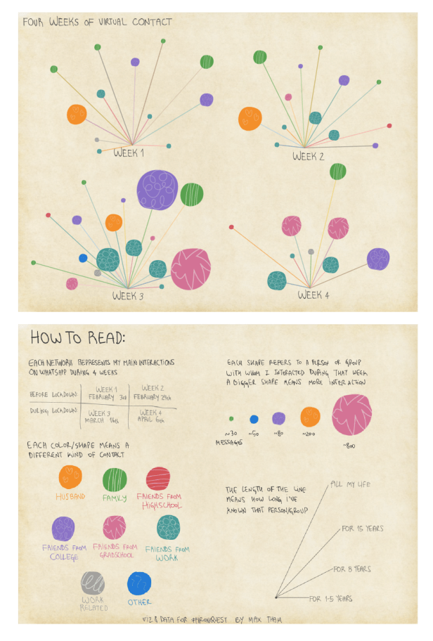 Four Weeks of Virtual Contact by Maz Tham
In a similar vein, Praveen tracked his Twitter activity during April and May. I think Twitter could take some inspiration from Praveen’s beautiful design!
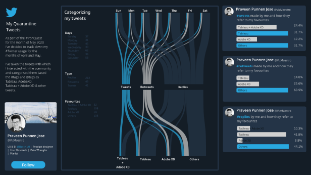 My Quarantine Tweets by Praveen P Jose
Many authors decided to track and visualise their health and fitness data this month.
In this example, Frederic mapped and visualised the routes he took on 1,000 different runs over a 10-year period! What an incredible achievement!
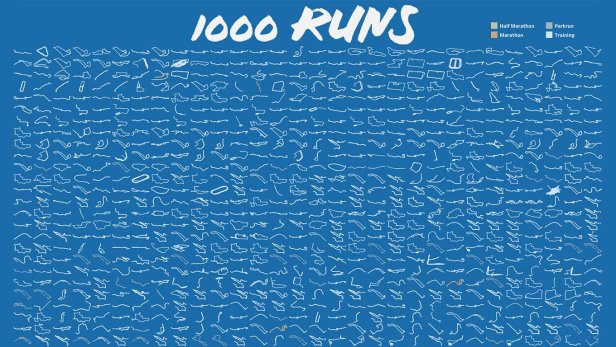 1,000 Runs by Frederic Fery
Other authors tracked their fitness activity during the lockdown period.
In this example, Natalia tracked the workouts she completed each day and the duration of each workout:
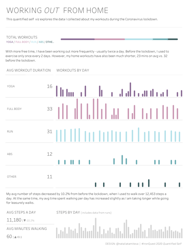 Working Out from Home by Natalia Miteva
In a similar take on the topic, Rosie tracked how her exercise habits changed since the quarantine was introduced:
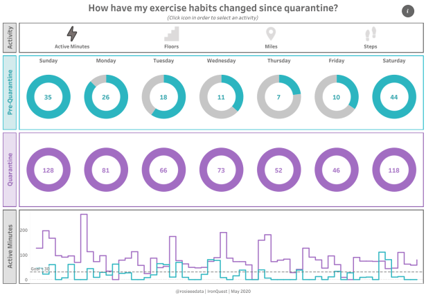 How have my exercise habits changed since quarantine? by Rosie Krieger
Many other authors opt to visualise data personal to them.
For example, Liam decided to deep dive into the data which Google holds on him. Liam quickly discovered that Google knows more than he initially thought!
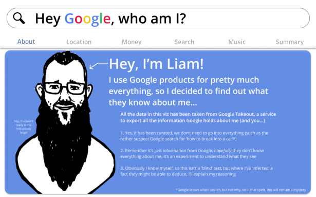 Hey Google, who am I? by Liam Spencer
In this Instagram-worthy viz, Meetali recorded the plants she has around her home and how she cares for them:
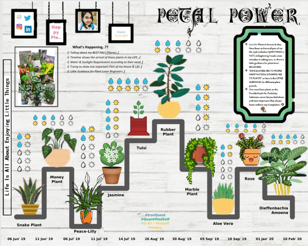 Petal Power by Meetali Pandey
A few authors decided to re-create their bullet journals in Tableau.
In this beautiful viz, Madalina visualised each of the sections from her bullet journal including her calendar, exercise, expenses and more!
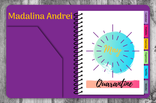 Bullet Journal by Madalina Andrei
In this fun Giorgia Lupi-inspired viz, Ratnesh teamed up with his five year-old daughter, Vartika to visualise their family. Vartika is officially the youngest #IronQuest participant to date and she already has very impressive Tableau skills!
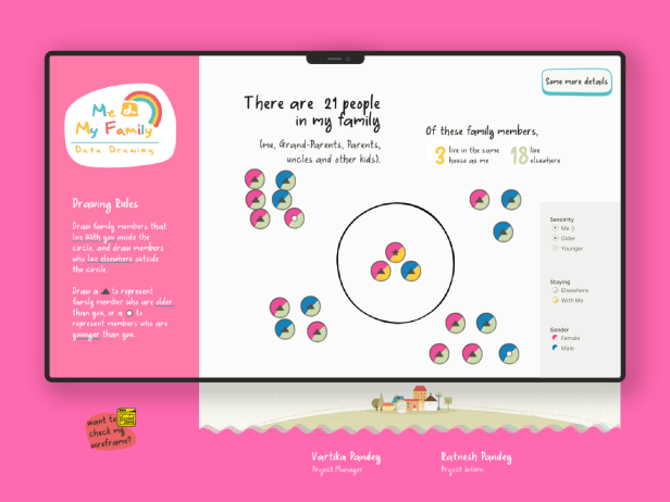 Me & My Family by Vartika & Ratnesh Pandey
The Submissions
THANK YOU to everyone who submitted entries for taking the time to create and share your work! Also, a big thank you to Ivett for being a fantastic co-host.
All of the entries (with the exception of those included above) are posted below in alphabetical order by first name (note: the placement of some vizzes have been adjusted slightly). If you tweeted your viz or thought you submitted one via the Google Form but don’t see it here, let me know and I’ll work to include any additional entries ASAP.
Please click on the links provided to view the visualizations on Tableau Public (or similar). Show your support for the participants by favouriting the vizzes you like the most.

From left to right:
Anjulika Sahgal | What do our books say about us?
Alex Johnson |Health Activity in a Pandemic
Aida Horaniet | WhatsApp

Arti Rajput | Colourful Quarantine Time
Ashwin Govindaraj | What’s on the Menu?
Anjushree Shankar |Quarantine Self Routine

Autumn Battani | My Millenial Wallet
Brian Moore | Where Have all The Dollars Gone?
Caitlin McCluskey | I Like to Read: An Exploration of my 2018 / 2019 Reading Habits
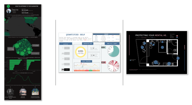
Cheryl Tan | Music Listened During Quarantine
Dang Ho | Self Tracking
CJ Mayes |Mental Health Week 2020
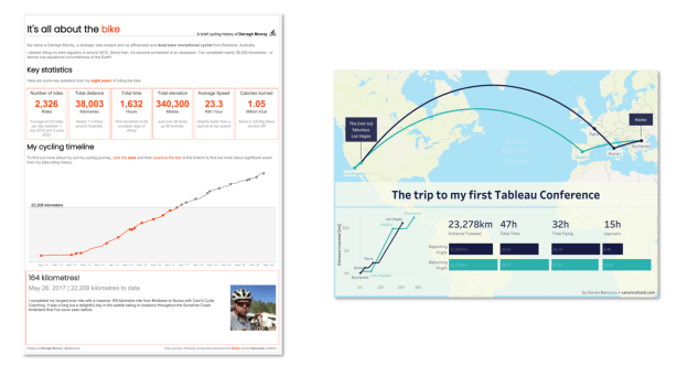
Darragh Murray |It’s All About The Bike
Dorian Banutoiu |The trip to my first Tableau Conference
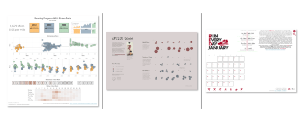
Eric Summers | Running with Strava
Evelina Judeikyte | Upside Down
Ellie Mason |My RED January 2020
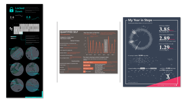
Gary Collins | Locked Down
Ghafar Shah | Quantified Self
Fred Najjar | My Year in Steps
Ingrid Arreola | 25 Minutes: Focused Mode
Jenny Martin |Couch to 5k made me a runner during lockdown
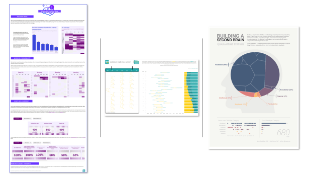
JR Copreros |Building a Second Brain | Quarantine Edition

All by Judit Bekker
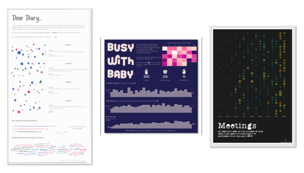
Julia Borsi | Dear Diary…quarantine is tough!
Katie Kilroy | Busy with Baby
Kate Schaub | Meetings
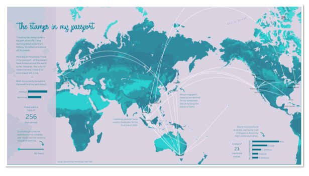
Kimly Scott |The Stamps in my Passport
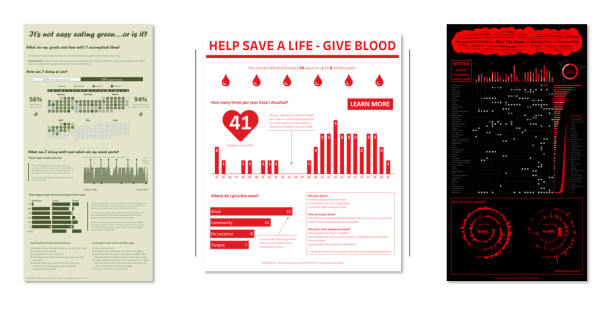
Michelle Frayman:
It’s not easy eating green…or is it?
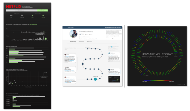
Mateusz Karmalski | My Netflix Stats
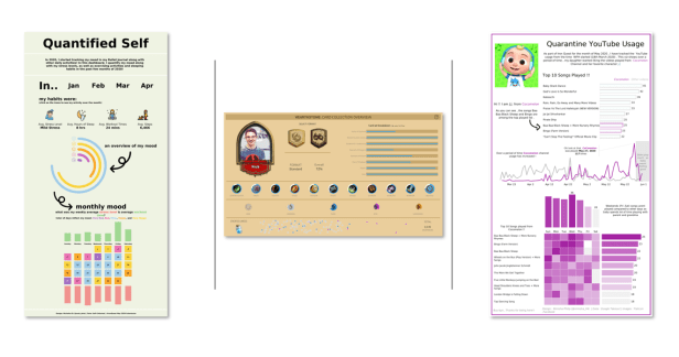
Michelle Oh | Quantified Self
Nick Jastrzebski |Hearthstone: Card Collection Overview
Nimisha Philip |Quantified Self-Quarantine YouTube Usage
Priyanka Dobhal | Netflix Activity
Pawan Sachdeva |My Data Viz Journey to 100… (Vizzes)
Priya Padham | How Are You Today?
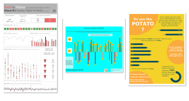
Simon Rowe | Sunday Night Football
Sedale McCall |How are you feeling really?
Riddhi Thakkar | Do You Like Potato?
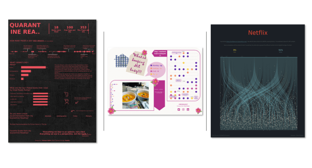
Taimoor Malik | Quarantine Reading
Swati Dave | What is Keeping me Busy?
Soha Elghany | Netflix
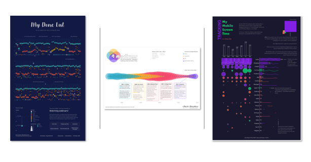
Wendy Shijia | My Done List
Zach Bowders |4 Mediums
Thi Ho |Tracking Mobile Screen Time
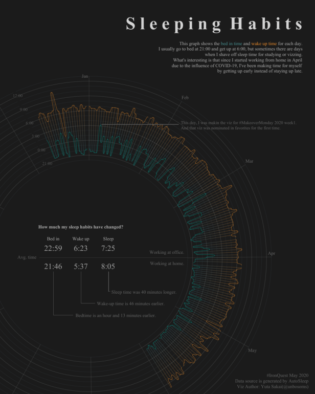
Yuta Sakai | Sleeping Habits
Iron Viz is Here!
Last week Tableau announced that Iron Viz is back and the prizes are bigger than ever before! Instead of three global qualifier contests, there will only be one global qualifier contest this year to determine the three finalists that will advance to the Iron Viz championship.
The theme for this year’s Iron Viz qualifier contest is Health and Wellness.
Submissions will be accepted until August 4th, 2020 (11:59:59 p.m. Pacific Standard Time). Full details can be found here.
I am honoured to be a first-round judge in the competition this year so I am exempt from entering or providing feedback on entries. However, I would love for some of you to put your #IronQuest skills to the test and enter the Iron Viz competition!
I strongly encourage you to explore the datasets suggested by Tableau in their blog post as a starting point. If none of these take your fancy, perhaps you could take some inspiration from this post! Alternatively, I encourage you to check out the #ProjectHealthViz data set library posted by Lindsay Betzendahl here.
Since the Iron Viz feeder is currently open, there will be no #IronQuest round this month. The project will resume in August.
Follow the hashtag #IronQuest on Twitter and LinkedIn and check out the #IronQuest section on my blog for the latest #IronQuest news.
Thanks for reading.
