
Before launching this round, I ran a live poll during my talk at the Tableau Conference in November to decide upon the next topic. From the various options presented, “Food & Drink” was the topic selected by the crowd. What a popular topic it proved to be!
We received a total of 31 entries for this round, making it the third most popular topic so far! Not only that but two of the submissions were also recognised by Tableau Public as “Viz of The Day”! Well done everyone!
It’s great to see new people continuously getting involved in #IronQuest. This round we welcomed six first-time participants to the project and we also saw a few #SportsVizSunday regulars return following our collaboration with the #SportsVizSunday team in October.
As usual, participants were creative with the theme and we witnessed a multitude of topics covered in the submissions. These included cocktails, bananas, coffee, Napa Valley, sugar, food prices, Singapore’s Hawker culture, cheese characteristics, Mole sauce, Girl Scout cookies, Gourmet magazine, the microbiology of food and food prices to name a few!
This month I had the pleasure of teaming up with Kevin Flerlage once again and together we provided feedback to those who requested it. We spent almost two hours reviewing 26 vizzes in depth and enjoyed sharing our thoughts on the submissions. You can listen to our feedback conversation here. As always, Kevin included some excellent tips in his feedback so please watch the video, even if you didn’t submit a viz.
Feedback Themes
Whilst reviewing the vizzes together, Kevin and I noticed a few reoccuring themes. These are common mistakes (aligned to the Iron Viz scoring criteria of design, storytelling and analysis) or areas for improvement to focus on in future vizzes. I hope you find these useful.
Theme 1: Background Colour
Before changing a viz background colour from the default white, ask yourself “does this viz really need a different background colour?”. Most of the time you’ll find a white background works perfectly well. Other coloured backgrounds can prove to be distracting or overwhelming. Take this example using one of Tableau’s default dashboards.
Using purple as a background colour here makes the viz look messy and the text becomes more difficult to read:

Meanwhile the same viz with a white background looks much more clean and concise. The text is easy to read and the dashboard doesn’t feel overwhelming.

Theme 2: Using multiple font styles or font sizes
Consistency is key here. Ask yourself, are you using the same font styles throughout the viz (expect perhaps for an eye-catching title or headers)? Are your font sizes logical? For instance are you using a larger font for headers or important things while using a smaller font for the main body text and footnotes?
Generally speaking, it’s best to keep it simple. Try to keep a consistent style throughout the viz and only emphase text with size, weight or colour when it is really necessary.
Theme 3: Chart Size
Some of the charts we reviewed for this round were particularly wide. Often they were stretched across the width of the viz, particularly in long-form vizzes. This can make charts more difficult to read and (particularly with line charts) trends become more difficult to see.
When we stretch line charts across the page, the line appears flatter, as in the example below:
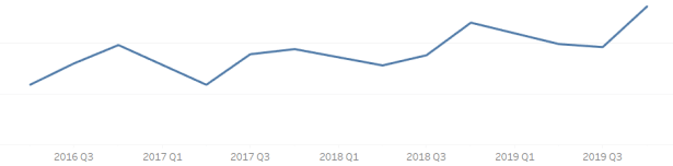
However if we make the same chart narrower, the path of the line is easier to see, as in the example below:

It’s best to aim for a 3×2 ratio (3 units wide, 2 units tall) when drawing bar and line charts. This will ensure they are concise and easy to read.
The Submissions
THANK YOU to everyone who submitted entries for taking the time to create and share your work! Also, a big thank you to Kevin for being a fantastic co-host.
The entries are posted below in alphabetical order by first name. If you tweeted your viz or thought you submitted one via the Google Form but don’t see it here, let me know and I’ll work to include any additional entries ASAP.
Please click on the links provided to view the visualizations on Tableau Public (or similar). Show your support for the participants by favouriting the vizzes you like the most.

From left to right:
Bo McCready | Relative Characteristics of 30 Cheeses
Brian Moore | The BAR-tifact

Ash Shih | Top Fast Food Chains
Chris Westlake | Trussell Trust Food Bank Usage

Both vizzes by Frederic Fery:

Gary Collins | Dangers and Costs of Excessive Sugar Consumption
Ghafar Shah | Ramen Noodles
Ingrid Arreola | Mole: A Journey on it’s History

Katelyn Schaub | The Cadence of Cocktails
Kevin Flerlage | Food Price Index

Kinsey Miller | Coffee Calculator
Jenny Martin | Britain is Bananas about Bananas
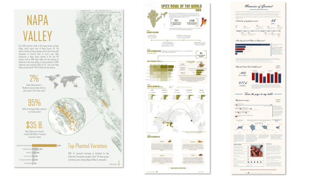
Maria Brock | Napa Valley
Meera Losani | Spice Bowl of the World – India
Michelle Frayman | Memories of Gourmet
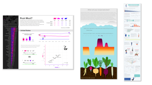
Steve Barham | Peak Meat?
Pippa Law | When will your receipe taste best?
Royce Ho | Singapore’s Hawker Culture

Ryan Lowers | Local Supermarket Food Sources
Regis O’Connor| The Wisdom of the Three Sisters
Simon Rowe | Restaurant health inspections in Chicago

Tanveer Jeddy | Pakistan’s Agricultural Export A Brief Analysis for 1987-2017
Virginia Moench | Food Insecurity

Wendy Shijia | China’s dairy imports, 2017-2019
Whitney Wood | Napa Valley Trip Planner
All by Young Song:
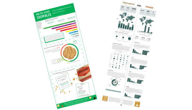
Zach Bowders & Kate Schaub |How the Cookie Crumbles: Making Cents of a Billion Dollar Industry
Vinodh Kumar V R | Food Waste & Hunger
The next round of Iron Quest will be announced very soon!
Follow the hashtag #IronQuest on Twitter and LinkedIn and check out the Iron Quest section on my blog for more info. Also, check out the #IronQuest submissions tracker here.
Thanks for reading.
