
Towards the end of 2018 I had the pleasure of attending a talk in London by Stefanie Posavec. This talk was to celebrate the launch of ‘Observe, Collect, Draw’; the hands-on visual journal and follow-on from ‘Dear Data’ by Information Designers, Giorgia Lupi and Stefanie. For those that don’t know ‘Dear Data’ was a year-long, analogue drawing project run by Giorgia and Stefanie a few years ago. Each week they collected personal data, drew visualisations of their data by hand and then exchanged these on postcards sent in the mail. ‘Observe, Collect, Draw’ was inspired by their project and guides (regular) people on how they can create similar hand-drawn visuals using personal data, including hands-on exercises.
At Stefanie’s talk she explained the background to the project and the challenges they faced along they way. In short, it was fascinating! I was surprised to learn that Giorgia and Stefanie didn’t know each other very well when they embarked on the project (I had assumed they were good friends) but given it’s very nature, the project gave them an opportunity to learn plenty about the other person and their personality along the way.
Anyway, back to my story! I purchased a copy of ‘Observe, Collect, Draw’ at the event where Stefanie spoke and I attempted some of the exercises in the book. However, I quickly realised I was useless at hand-drawn data viz, despite finding it enjoyable. I had a brainwave – wouldn’t it be great to try a Dear Data style project with somebody from the Tableau Community. So, on 30th November 2018 I reached out to Ann Jackson to see if this is something she would be interested in trying. I was keen to stay true to the original and collaborate with somebody overseas (for the original ‘Dear Data’, Giorgia was living in the U.S. and Stefanie was living in London). Ann resides in Phoenix, AZ and I live in Hampshire, UK.
Here’s a copy of my message to Ann and her response:
To my surprise, Ann was up for the challenge! So…..we spent December sorting out logistics, purchasing supplies (namely pens and postcards) and we also had a Christmas-themed test run to gauge postage times (spoiler alert – they are slow). On 31st December we kicked things off for real.
My Postcard
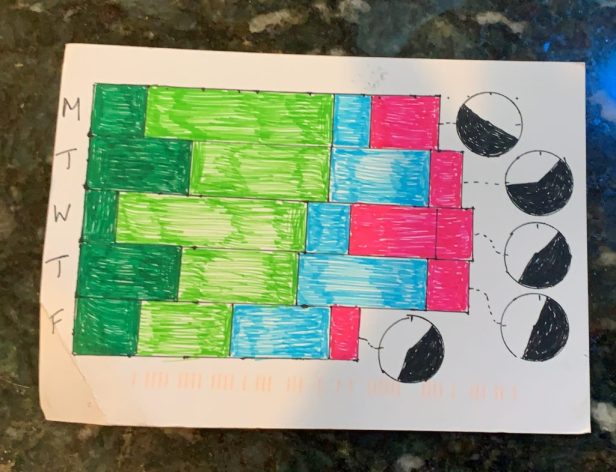
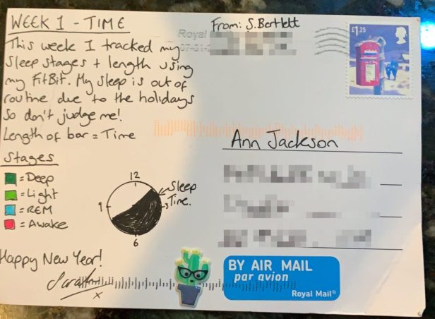
For week 1, we tracked time. We were supposed to track the number of times we looked at the clock during the day. However, I was on annual leave that week, day 1 was New Years’ Eve and my routine was completely out of sync due to the Christmas break. I was actually trying to pay less attention to the time that week so knew I wouldn’t be checking the time half as much as usual.
With this in mind I decided to track my sleep data using my FitBit instead. The data I collected was by no means reflective of my normal sleep schedule! Most nights that week I stayed up late watching Netflix and I was getting up later than usual with no work or school commitments.
Tracking the data itself was very easy as my FitBit essentially did it for me. However, I found designing and drawing the visual particularly challenging. I wanted to design something different to the default FitBit sleep charts but I wanted to keep the chart type simple and familiar. I am so accustomed to tools like Tableau drawing the visual for me, drawing something by hand with actual data behind it is a completely alien concept.
I used graphical paper to draw my first draft. This made it easier to measure the length of the bars, etc. However, I found it difficult to copy the chart onto the postcard using this method (I actually made a mistake which you might notice on the postcard). The pie/clock charts were a late addition. Unfortunately I misjudged the size of a 5-pence piece so using this as a drawing tool resulted in larger circles than I had hoped. My cumbersome-efforts definitely taught me a lot this week!
Ann’s Postcard
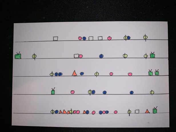
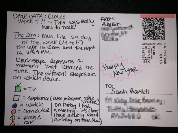
Ann took a completely different approach to me this week. Firstly, she actually stuck to the brief! In terms of her design, I love the minimalist feel to it. She’s packed in a lot of information by using shapes to not only indicate when she checked the time but also the device which she looked at. It’s funny looking at Friday (when she had a meeting) and how often she tracked the time on the way there to ensure she wasn’t late.
Read Ann’s summary of week 1 here.
Thanks for reading.
