
For the 2018 Tableau ‘Iron Viz Europe’ completion I build a viz which included bar charts that use custom shapes as axis label instead of text. For example:
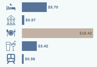
In this case I used intuitive icons to represent each category (for instance, a train to represent ‘travel’, a plate and cutlery to represent ‘meals’, etc). To avoid any misinterpretation I also included a description of each icon in a separate section of the viz, as well as in the chart tooltips.
I think these charts provide a fun way of displaying information without distracting attention away from the chart itself.
Let’s explore how you can go about creating a similar chart yourself.
Finding and Installing Custom Shapes
Personally I use Noun Project to find and download custom shapes and icons for my projects. The icons are free to download by default but if you don’t hold an account you must credit the author of each shape you use. You can also download similar icons from sites like Flat Icon. There is an excellent list of 49 websites where you can find and download free icons on Canva here.
Be mindful that some sites may require attribution or a link back in exchange for using their graphics. Always double-check the terms of usage with each download because the terms can change at any time. If a site does require attribution, you can always add this to a footer on your viz or in the tooltips.
Once you have sourced your custom shapes, locate the “My Tableau Repository” folder on your PC. Within this folder you should have a folder called “Shapes”. Create a new folder within Shapes, give it a logical name (the name you choose will be used to identify the shape family in Tableau) and add your custom shapes (as PNG files) to this folder.
Building the Chart
- Create a regular bar chart in Tableau. In this example I am displaying the bars horizontally but this method would work for charts with vertical bars too.

Note: You’ll need to create a ‘fake’ space on the columns shelf for your icons. The size of this space will depend upon the size of your data set. In the example in step 2 below, AVG(-2.5) worked for me but I suggest you experiment to find what size space works best with your data.
2. On the columns shelf, double-click in the space to the right of the “SUM(Cost)” pill and type “AVG(-2.5)” then press enter. This will create a new pill on the columns shelf and an additional axis.

3. On the AGG(AVG(-2.5) marks card, change the mark type to “Shape” and remove anything you may have from labels. The shape on the secondary axis will likely default to a circle.

4. Drag the “AGG(AVG(-2.5)” pill from columns shelf to just above the top bar in the view, until you see the dashed lines displayed. Releasing the mouse on the dashed line will create a dual axis:

5. Right-click on the secondary axis (the one at the top) and click “Synchronize Axis”.

6. Drag your dimension (in this case “Item”) to ‘Shape’ on the marks card. This will automatically assign a shape to each item on your secondary axis, changing the circles to the default Tableau shapes. At this point you can change your shapes to the ones you added to your Tableau Shapes file at the beginning;
- Select ‘Reload Shapes’
- From the drop-down menu, locate your shape folder
- Assign the palette to each data item, either automatically by clicking ‘Assign Palette’ or manually by selecting a data item from the list then clicking the desired shape from the right-hand pane. If using the automatic option, always check your shapes have been assigned correctly:

7. Review the placement of your icons next to the bars. If they appear to be placed too close or too far away from the bars for your liking, edit the “AGG(AVG(-2.5))” pill, either by changing this to a lower or higher number (the lower the number, the further away from the bars the icons will be placed). I suggest you work on a trial and error basis until you have the placement just right.
8. Click on the Dimensions (“Items”) pill on the Rows shelf and from the menu select ‘Show Headers’ to remove the traditional axis labels from the view. Only the icons should remain next to the bars.

9. Clean up the remainder of the chart by right-clicking on each x-axis and selecting ‘Show Header’ to remove the axis from the view.

This method is great for charts that only include a handful of categories where intuitive icons can be applied and would be appropriate. I wouldn’t recommend this approach if you have a chart with lots of categories or which require icons that are difficult to understand.
I hope you found this tutorial useful.
Thanks for reading.

Useful tip Sarah, thank you!
LikeLiked by 1 person
Great idea Sarah!
LikeLiked by 1 person
Thanks Kate!
LikeLike
So I just realized, you may want to edit the “-2.5” suggestion as that is going to depend on the size of the data. When I was working with data that had numbers in the billions, -2.5 wasn’t going to move my axis over enough. So this is really just a value to create a “fake” space for your icons. 🙂 Still love this idea, just thought I’d mention that the number may need to be adjusted accordingly.
LikeLiked by 1 person
Yes you’re right Lindsay. Thanks for pointing that out. I’ll update the post.
LikeLike
This is a really handy tip – thank you! I played around with it and extended the example to allow the user to choose a measure to display against the custom axis. To get the offset to work in each case I made it dynamic using a Window_MAX that divides the maximum value by 10 and multiplies it by -1 in place of the fixed AVG(-2.5). Probably won’t work in every case but it was fun to experiment regardless 🙂
LikeLiked by 2 people
Great article – thank you for posting.
LikeLike
Hi great rreading your post
LikeLike